Beam
Complete platform re-design, new visual identity & updated brand guidelines.
Highlights
9.6 rating from beneficiaries
1,250 people supported
£37.8m taxpayer savings
Project Details
Beam is an award-winning crowdfunding platform and charity built to support homeless people through training and into stable, paid work.
After volunteering for 2 weeks to help identify potential improvements to Beam’s existing site, I worked directly with the team for 5 months on a complete re-design of the platform including a new donation experience, various educational pages focussing on establishing Beam’s credibility, and an updated brand / visual language with easy-to-follow guidelines.
Roles
UI / UX / Prototyping / Branding / Strategy
Year
2019
Industry
Non-Profit
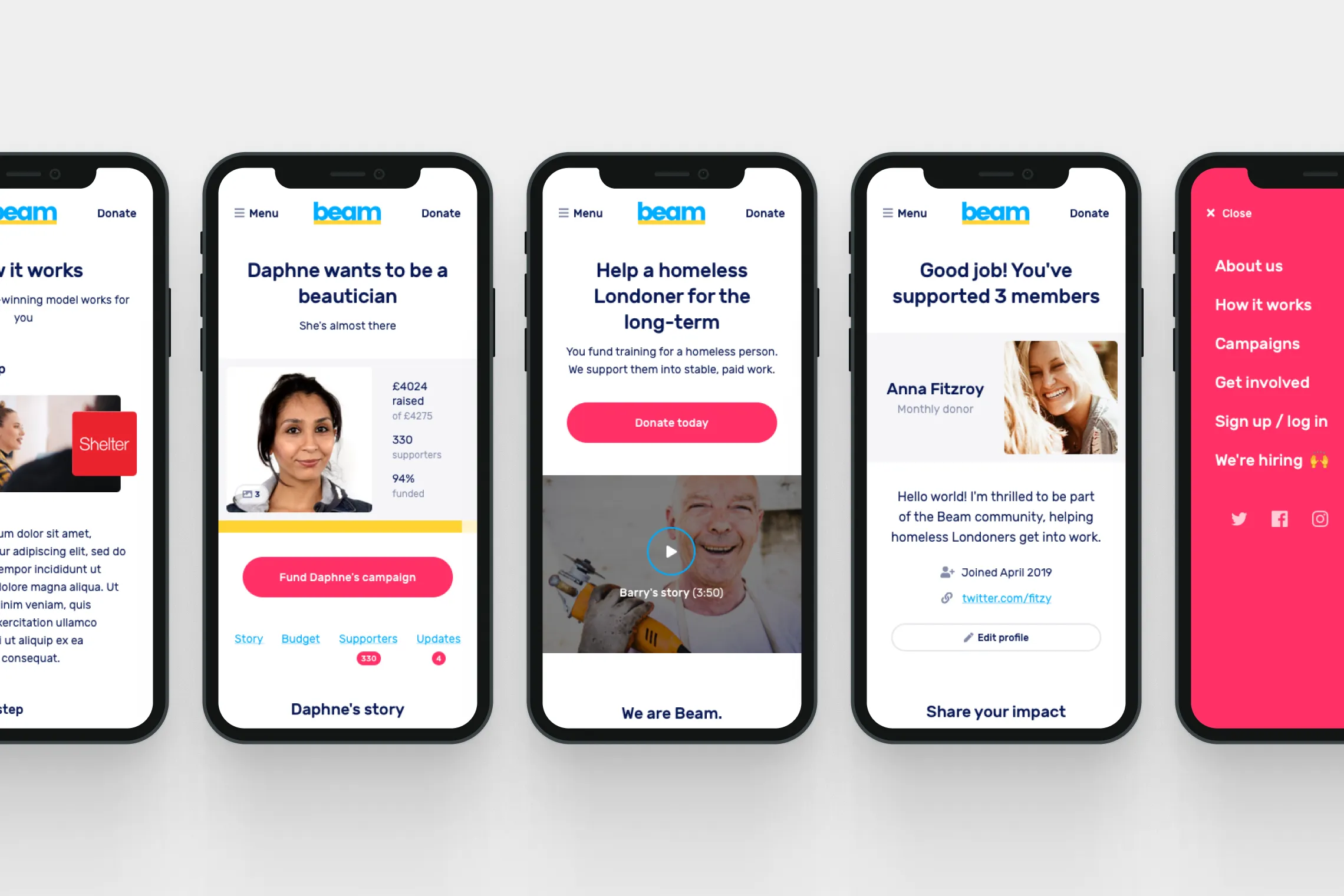
Mobile mockups
Research & analysis
Research implied that visitors (defined as new, unregistered users) were interested in information about Beam, how it worked and how credible it was, before feeling comfortable donating.
From interviews we concluded that visitors:
1. Believed homelessness referred exclusively to living on the streets.
“The first thing I think is that you’re going to provide shelter.”
Louise, Marketing, 30s
2. Misunderstood Beam’s role in supporting homeless people.
“Am I supposed to set up a campaign for somebody?”
James, Entrepreneur, 30-40s
3. Couldn’t find information to shed light on confusion.
“How do people choose who to support?!!”
Claudio, Data Engineer, 20s
4. Left the site unwilling to donate because of it.
"I'm just not entirely comfortable yet with handing over my details."
Ben, Civil Servant, 40s
Education was a necessary factor in conversion, so a lack of it acted as a blocker to donations. This situation wasn’t helped by the fact that only 6% of visitors (7.8% of all traffic) actually came with the intention of donating to begin with.
Logo
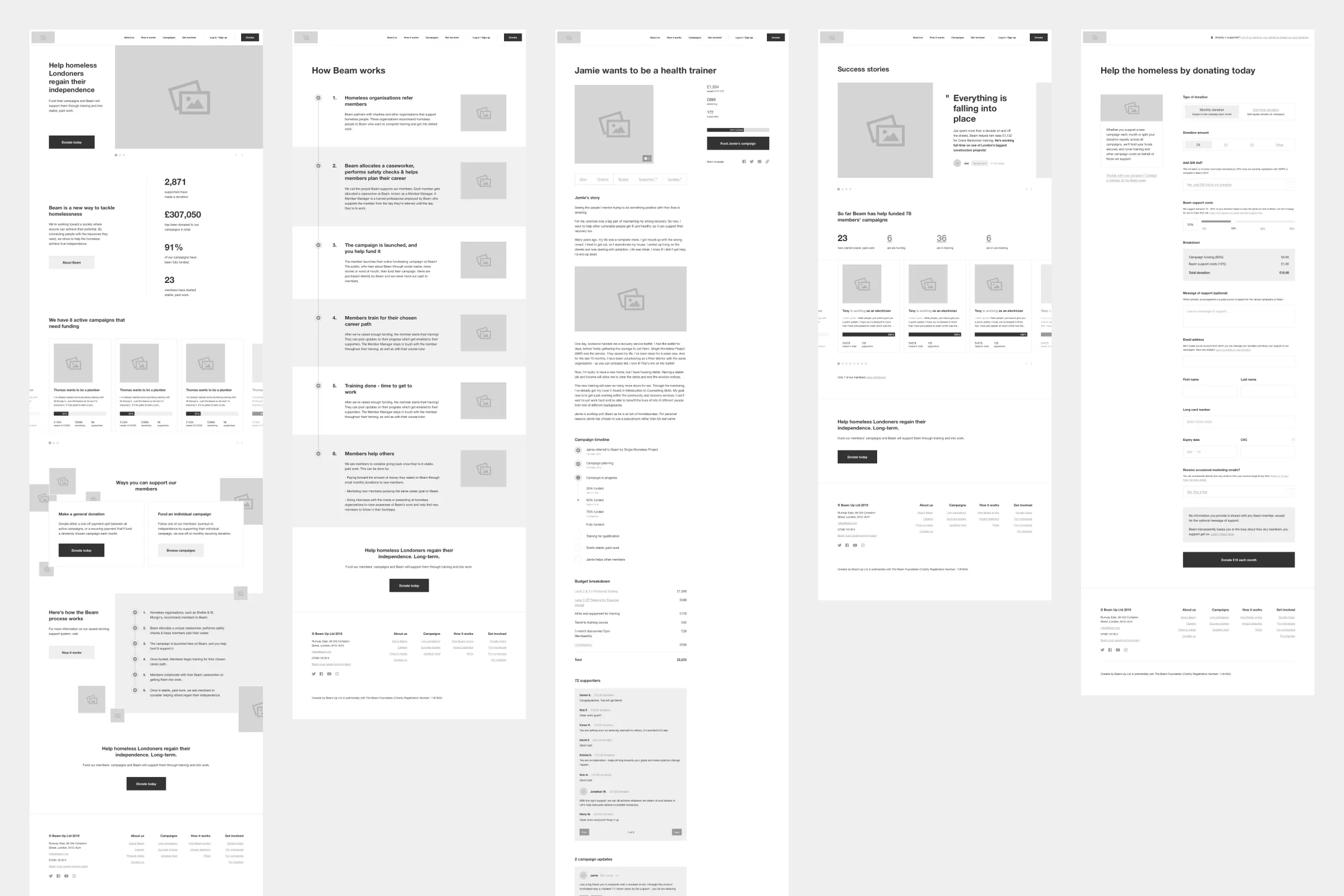
Wireframes
Design & approach
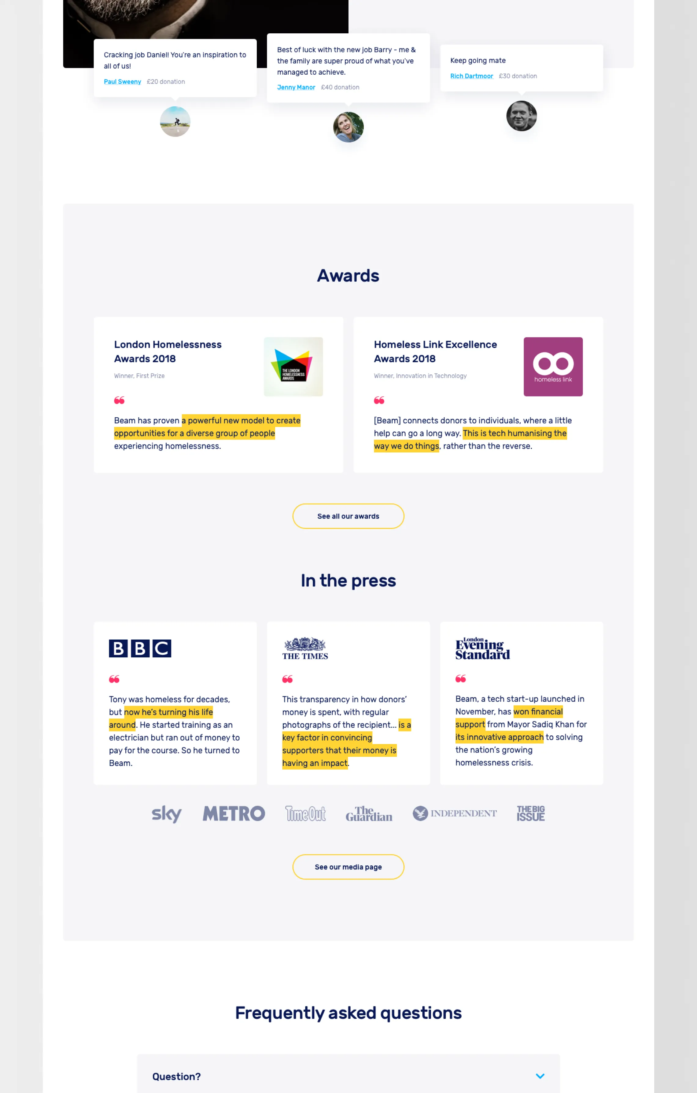
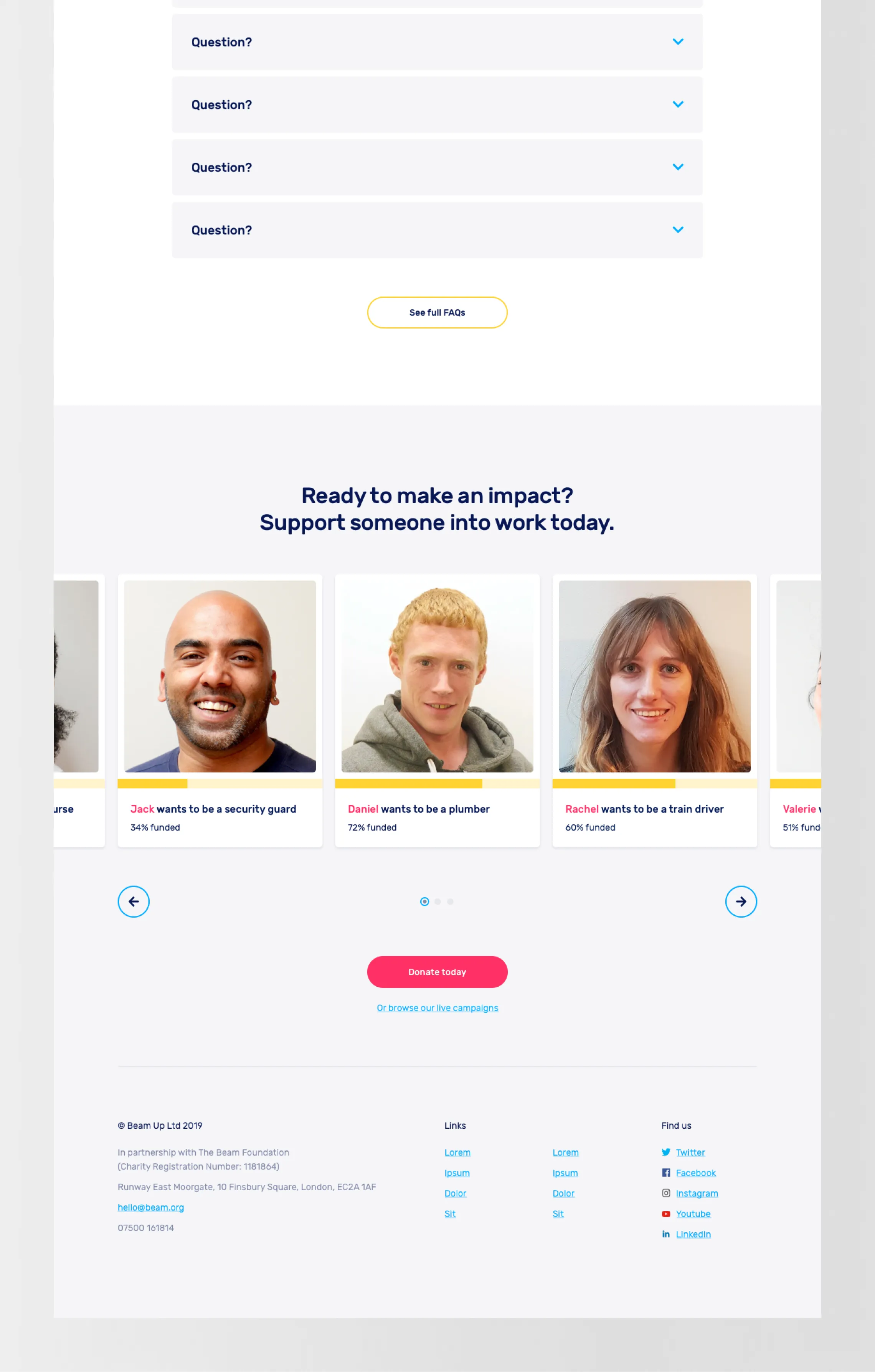
The new brand & experience were aimed at establishing trust / understanding in the Beam model and how it worked, to provide a frictionless donation experience. One method we used was to categorise each and every major page on the site as either education or conversion focussed. Whilst often pages were a mix of both, the process of identifying a dominant driver of behaviour for each page allowed us to be more deliberate about what journey we wanted visitors to take.
I worked directly with CEO Alex Stephany and Head of Engineering Julian Keenaghan to design the new website experience and visual identity, alongside one of my previous colleagues, PM Tara Bradberry.
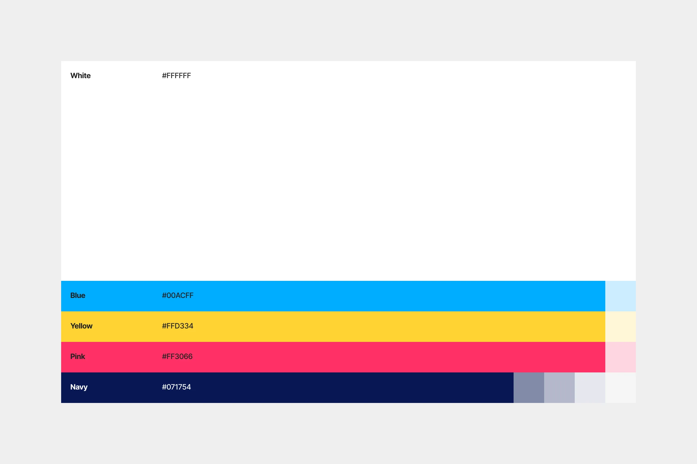
Colour palette
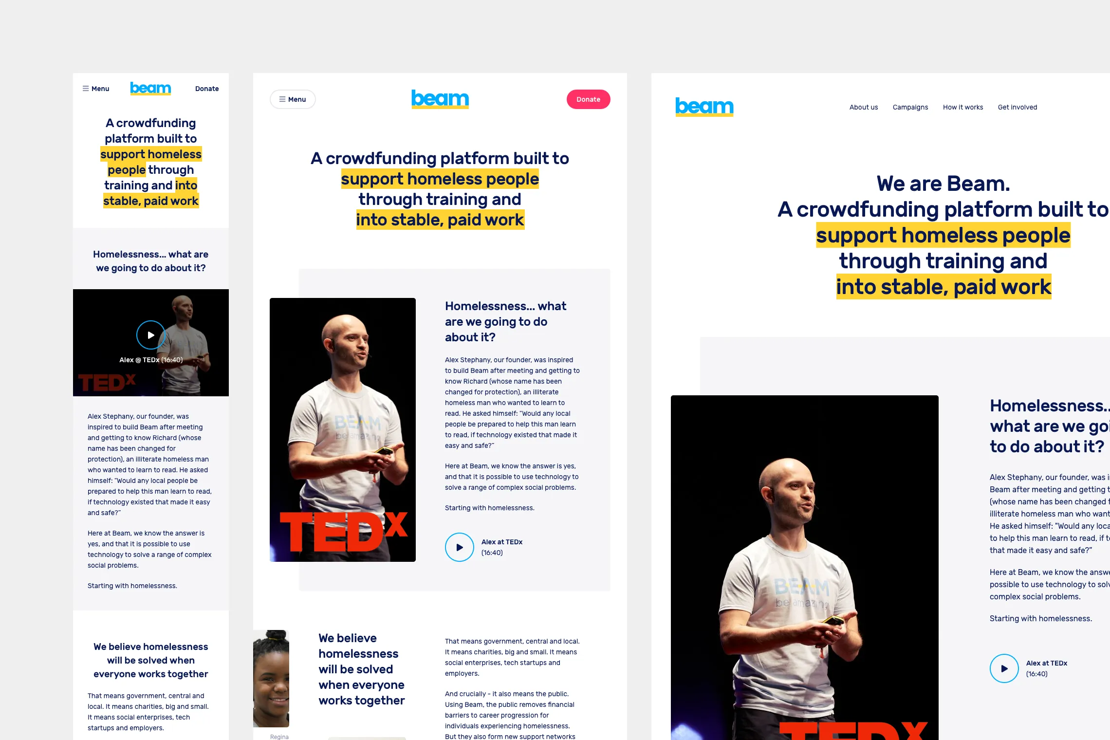
Responsive design
Beam had not collaborated with a product-focussed team before this, so one of our key responsibilities was to introduce the processes required to make this project a reality. This included task boards, stakeholder surveys, user interviews, problem statement construction, and design materials such as wireframes & prototypes.
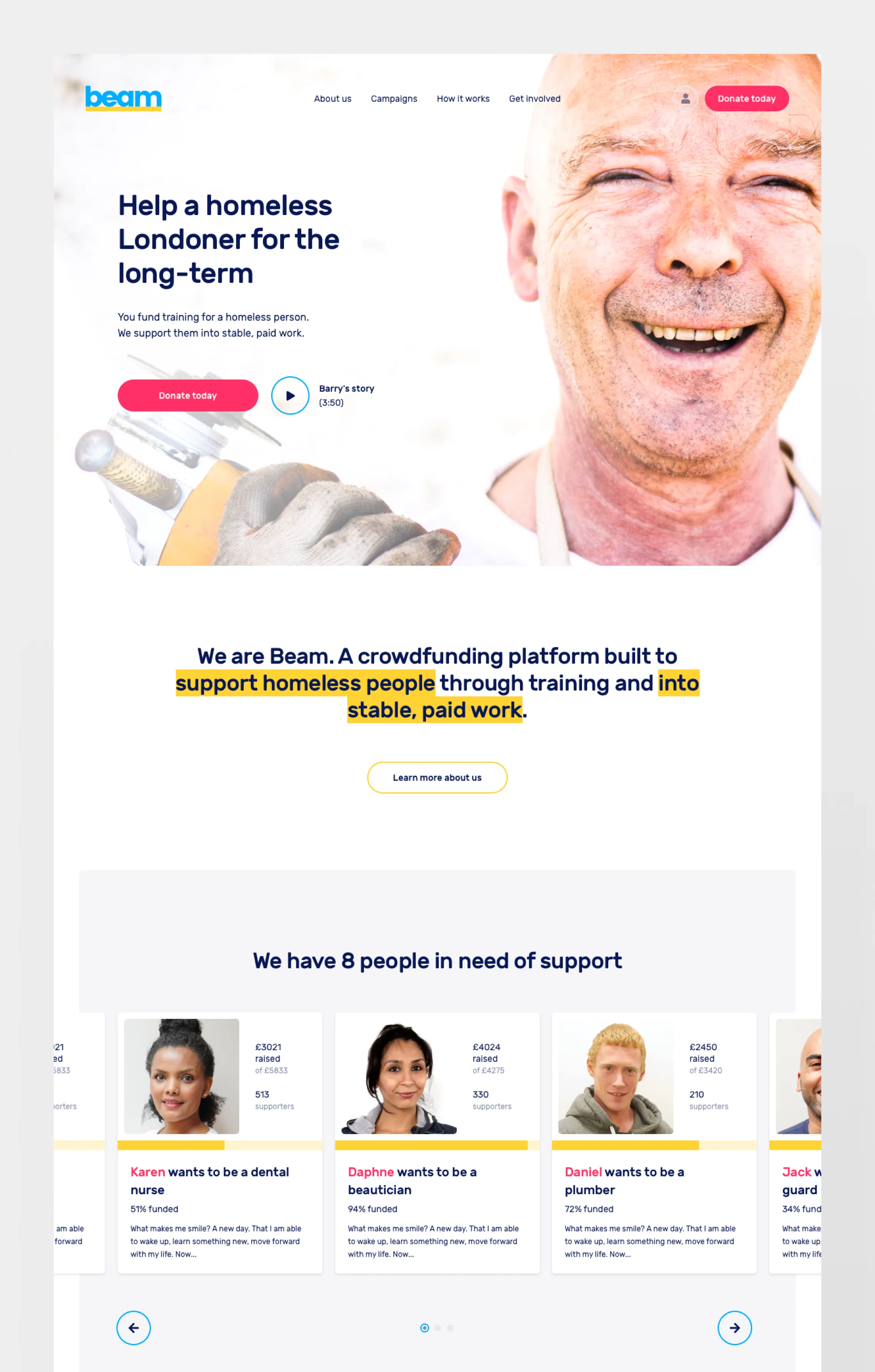
Landing page
Guidelines
Component construction
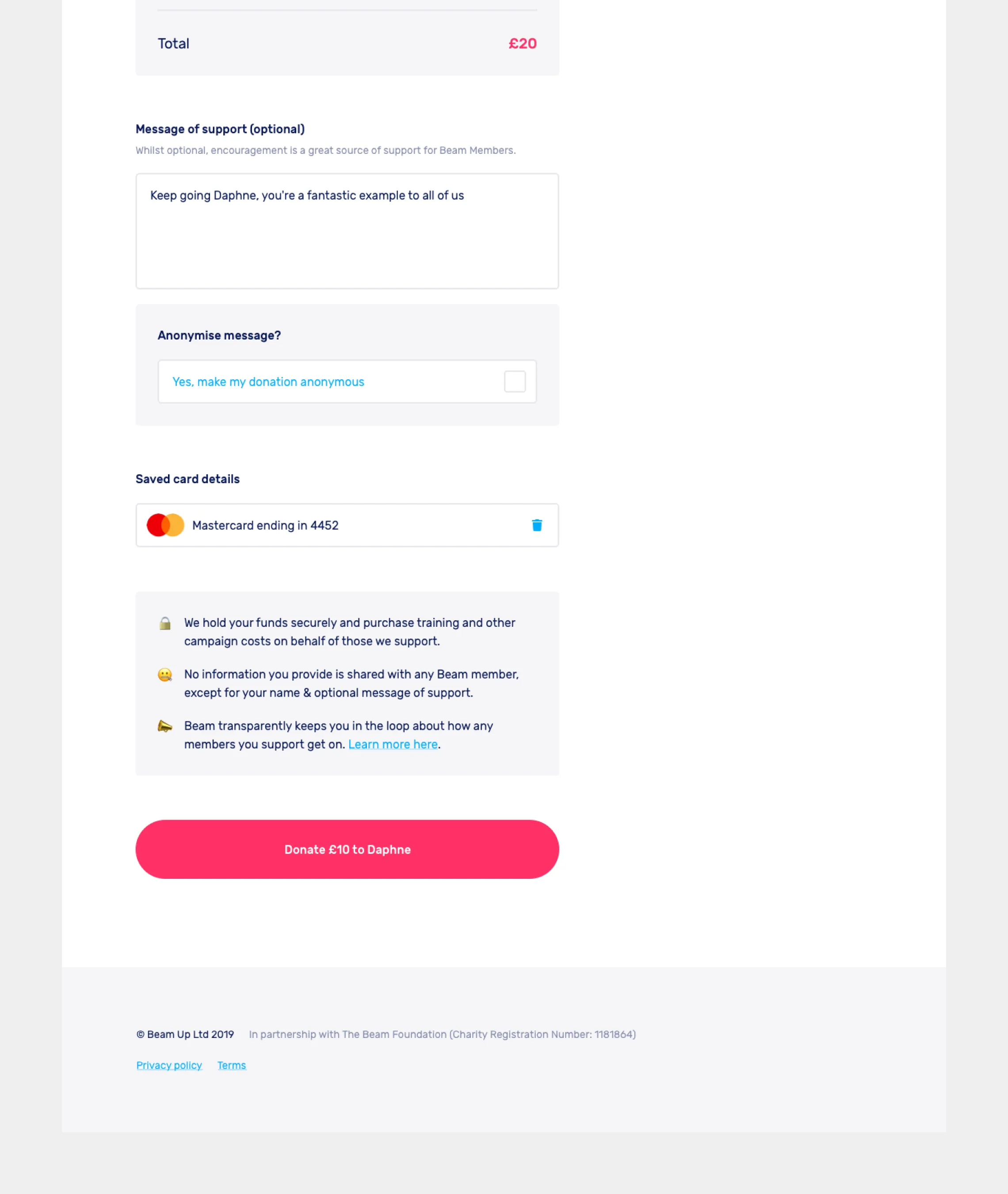
Checkout page
Outcomes
The new site launched late 2019. Our final delivery included:
92 responsively designed screens (via Zeplin)
2 full-site prototypes (via Marvel)
Digital style-guide (via Zeplin)
Brand guidelines (PDF)
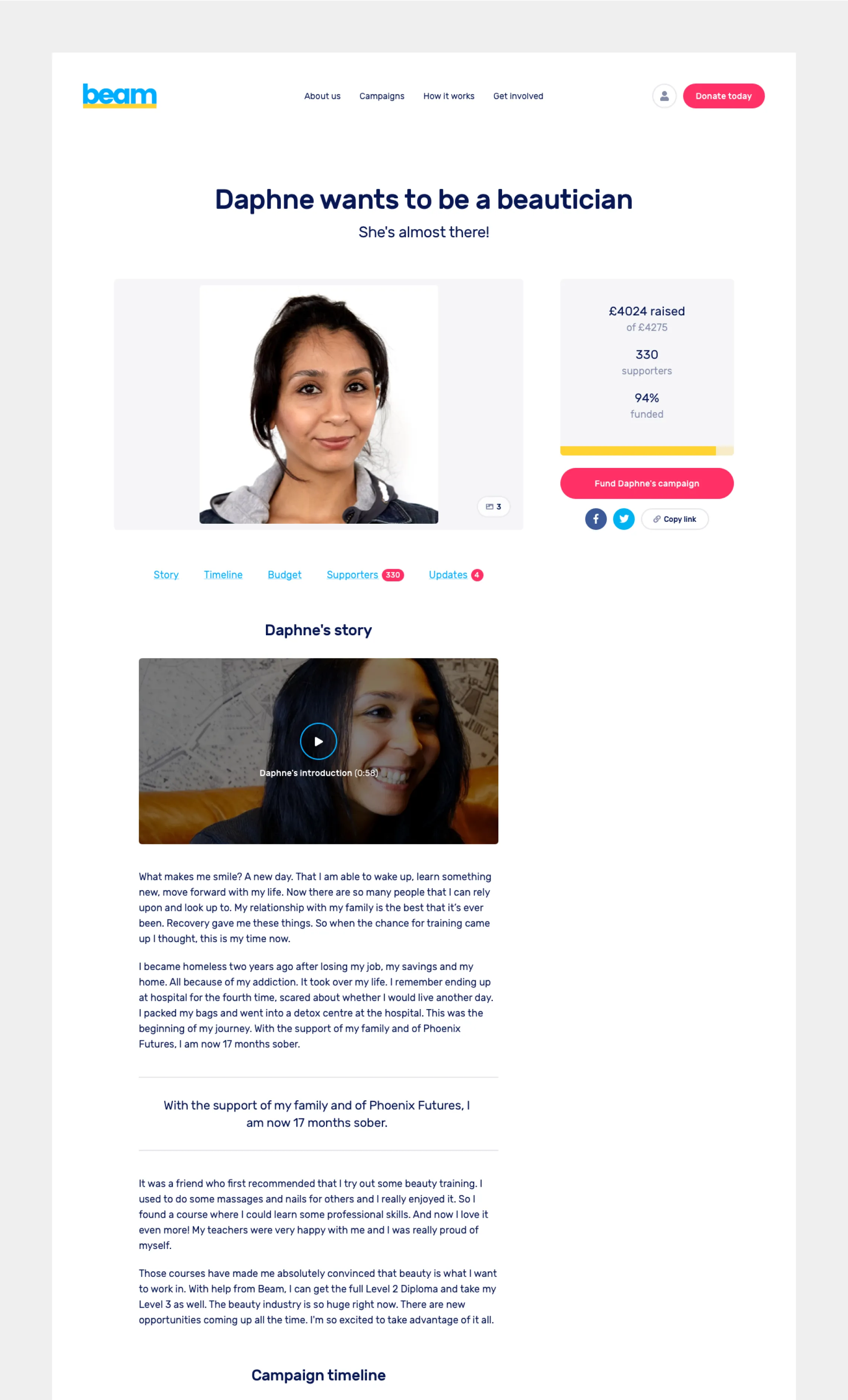
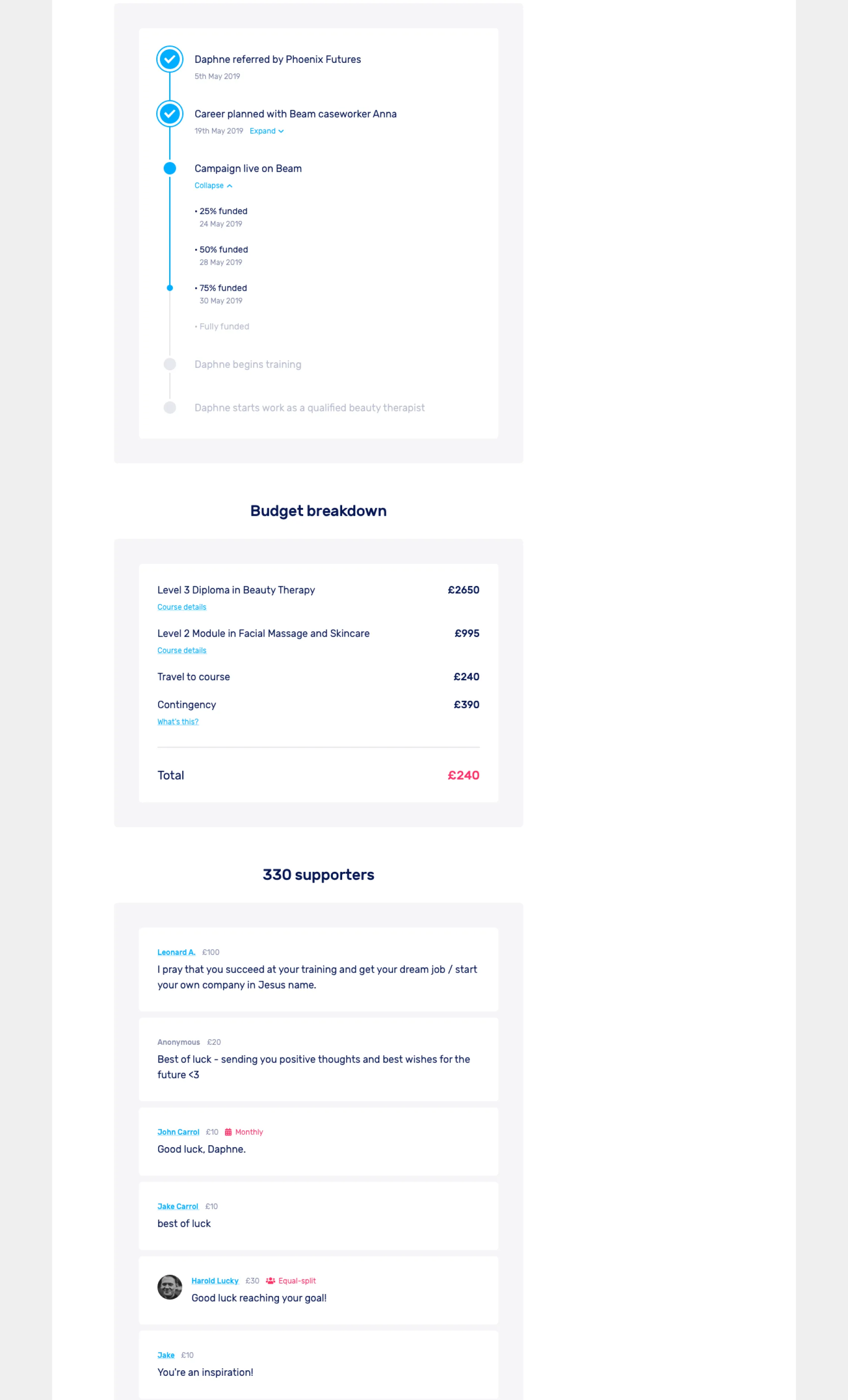
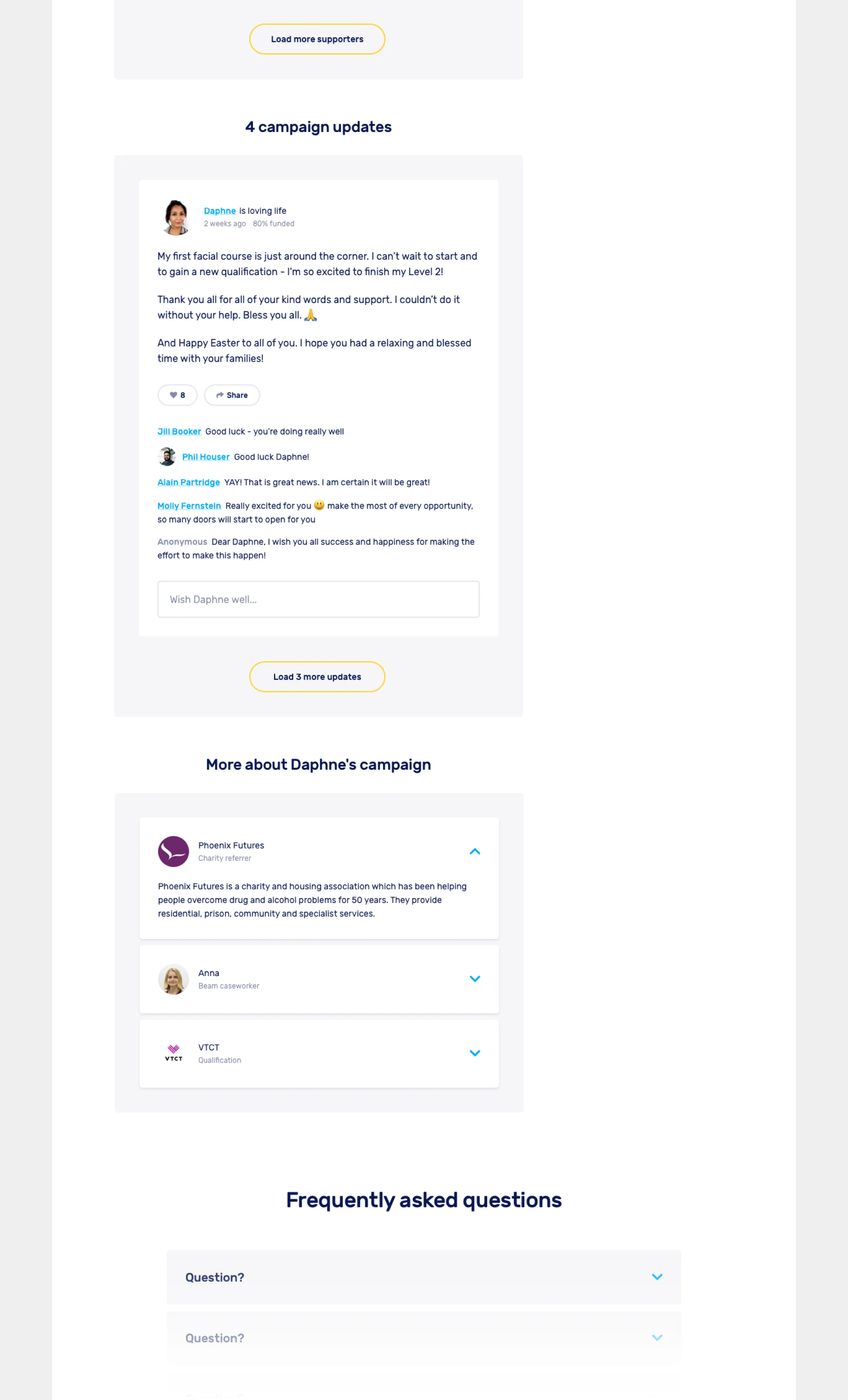
Campaign page — Before & after
The new design for Beam was received well by the user base, who felt it was modern, credible and easy to navigate.
“A very trustworthy looking site.”
“New [homepage] looks a lot more professional and is much more effective.”
“Gives me the feeling I can change someones life.”
“Where I really connect with it is where you show pictures of the people.”
“Very clear how money is going to be spent... good to see other supporters’ comments.”
“Credible & clear.”
Beam continues to support people into stable, paid work to this day, having made great strides in their mission. As of 2023, Beam has supported 1,233 people. 81% find work through their Beam campaign, with 86% of those enjoying sustained employment beyond 3 months.
Beam has also expanded into support for refugees, making them 3 times more likely to secure jobs. You can more about Beam’s incredible impact here:
Campaign page
'How it works' page — Mockups
Learnings
Take overly positive feedback with a pinch of salt
People are reticent to be anything but positive about charities, which can lead to problems when running user interviews. Sometimes a reminder is needed that their comments aren’t criticism, but necessary feedback for improvement — a learning that can apply to all user interview situations.
Prototypes are good for research, GREAT for delivery
I made heavy use of prototypes for gathering insights from our user research, but they proved useful early on in giving Julian a cohesive direction for where we were going. The final delivery for build included site-wide prototypes for both desktop and mobile, annotated and explained to help fill in any gaps.
Testimonial
“Sam is a great product designer - genuinely user focused and will instinctively approach product holistically. He also reliably makes great char sui recommendations.”
Tara Bradberry
Product Manager
Beam
Complete platform re-design, new visual identity & updated brand guidelines.
Highlights
9.6 rating from beneficiaries
1,250 people supported
£37.8m taxpayer savings
Project Details
Beam is an award-winning crowdfunding platform and charity built to support homeless people through training and into stable, paid work.
After volunteering for 2 weeks to help identify potential improvements to Beam’s existing site, I worked directly with the team for 5 months on a complete re-design of the platform including a new donation experience, various educational pages focussing on establishing Beam’s credibility, and an updated brand / visual language with easy-to-follow guidelines.
Roles
UI / UX / Prototyping / Branding / Strategy
Year
2019
Industry
Non-Profit
Mobile mockups
Research & analysis
Research implied that visitors (defined as new, unregistered users) were interested in information about Beam, how it worked and how credible it was, before feeling comfortable donating.
From interviews we concluded that visitors:
1. Believed homelessness referred exclusively to living on the streets.
“The first thing I think is that you’re going to provide shelter.”
Louise, Marketing, 30s
2. Misunderstood Beam’s role in supporting homeless people.
“Am I supposed to set up a campaign for somebody?”
James, Entrepreneur, 30-40s
3. Couldn’t find information to shed light on confusion.
“How do people choose who to support?!!”
Claudio, Data Engineer, 20s
4. Left the site unwilling to donate because of it.
"I'm just not entirely comfortable yet with handing over my details."
Ben, Civil Servant, 40s
Education was a necessary factor in conversion, so a lack of it acted as a blocker to donations. This situation wasn’t helped by the fact that only 6% of visitors (7.8% of all traffic) actually came with the intention of donating to begin with.
Logo
Wireframes
Design & approach
The new brand & experience were aimed at establishing trust / understanding in the Beam model and how it worked, to provide a frictionless donation experience. One method we used was to categorise each and every major page on the site as either education or conversion focussed. Whilst often pages were a mix of both, the process of identifying a dominant driver of behaviour for each page allowed us to be more deliberate about what journey we wanted visitors to take.
I worked directly with CEO Alex Stephany and Head of Engineering Julian Keenaghan to design the new website experience and visual identity, alongside one of my previous colleagues, PM Tara Bradberry.
Colour palette
Responsive design
Beam had not collaborated with a product-focussed team before this, so one of our key responsibilities was to introduce the processes required to make this project a reality. This included task boards, stakeholder surveys, user interviews, problem statement construction, and design materials such as wireframes & prototypes.
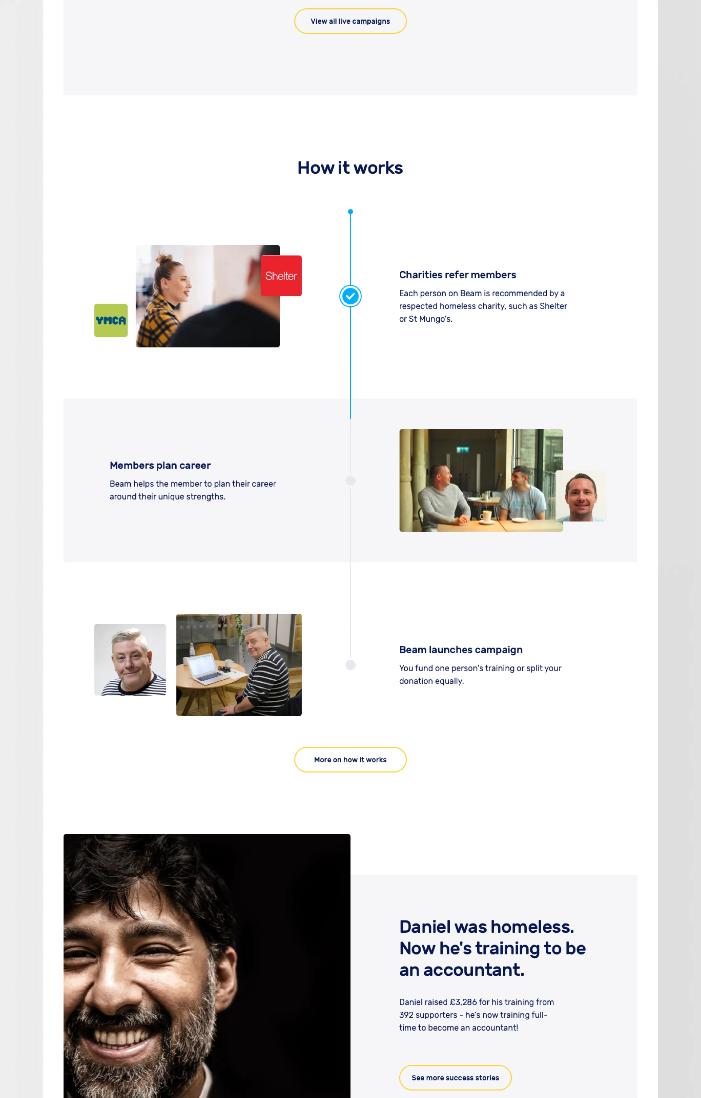
Landing page
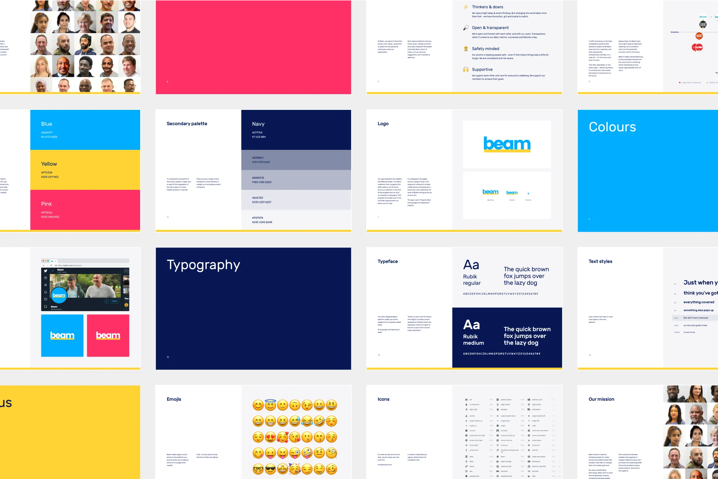
Guidelines
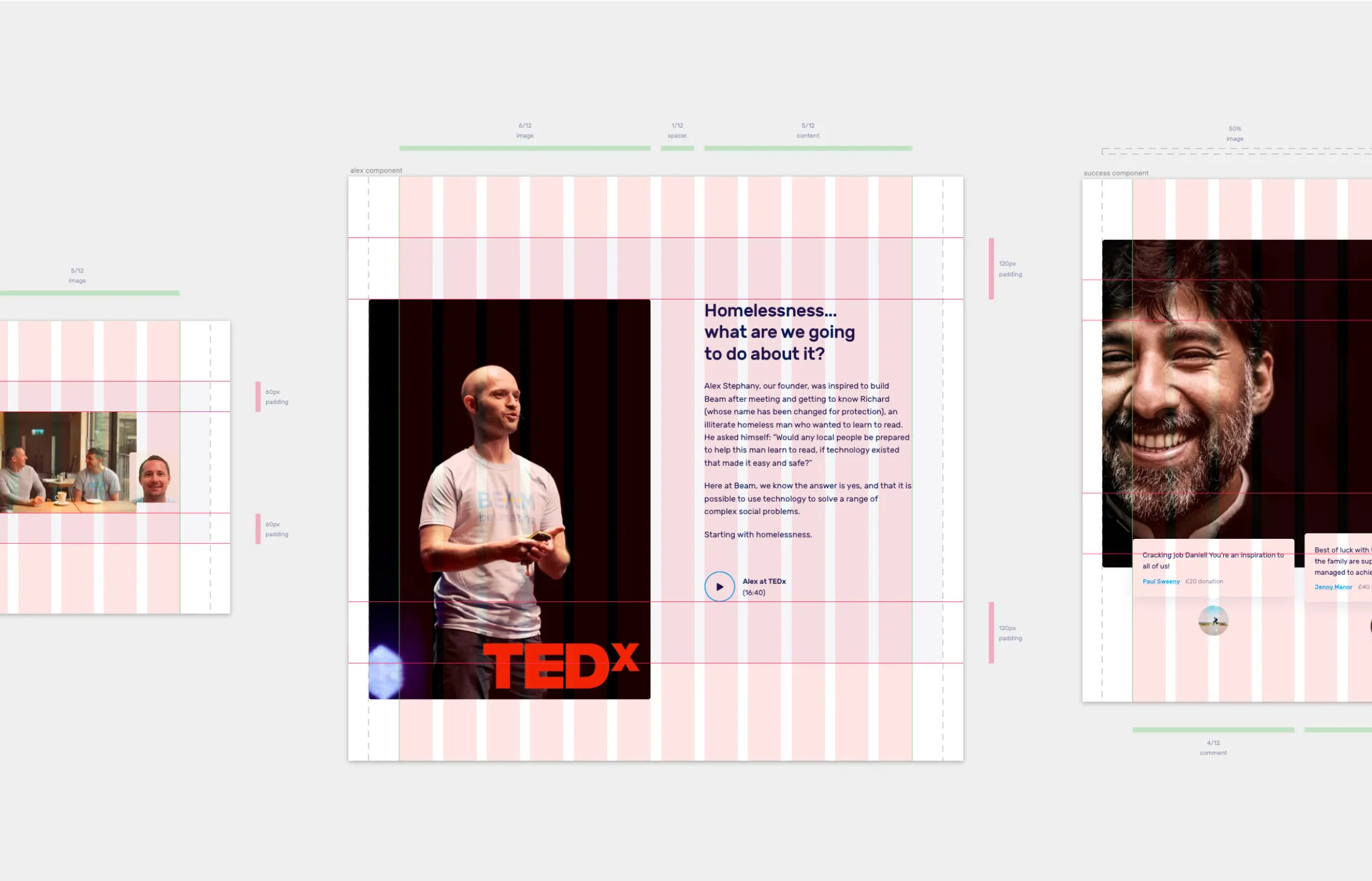
Component construction
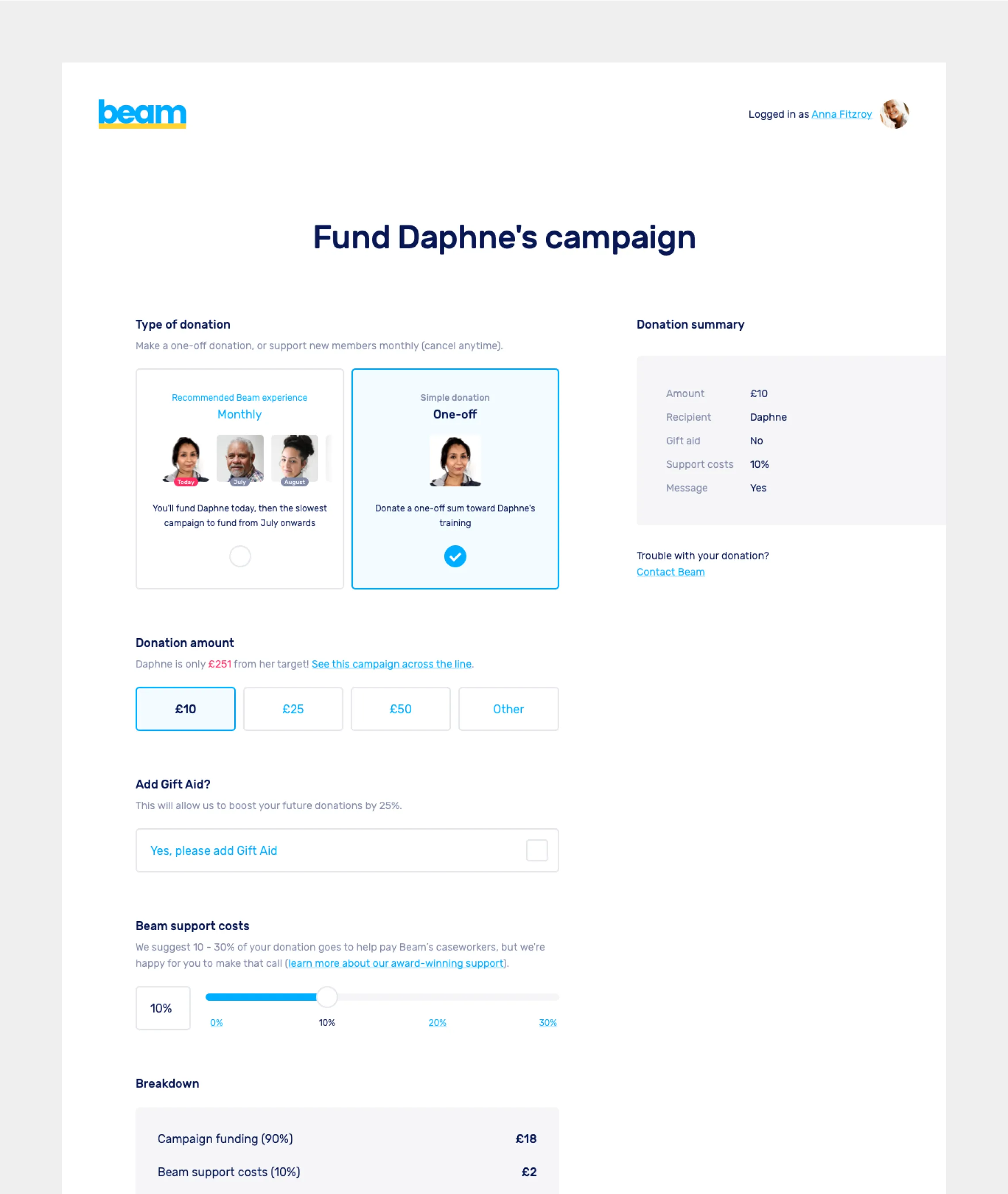
Checkout page
Outcomes
The new site launched late 2019. Our final delivery included:
92 responsively designed screens (via Zeplin)
2 full-site prototypes (via Marvel)
Digital style-guide (via Zeplin)
Brand guidelines (PDF)
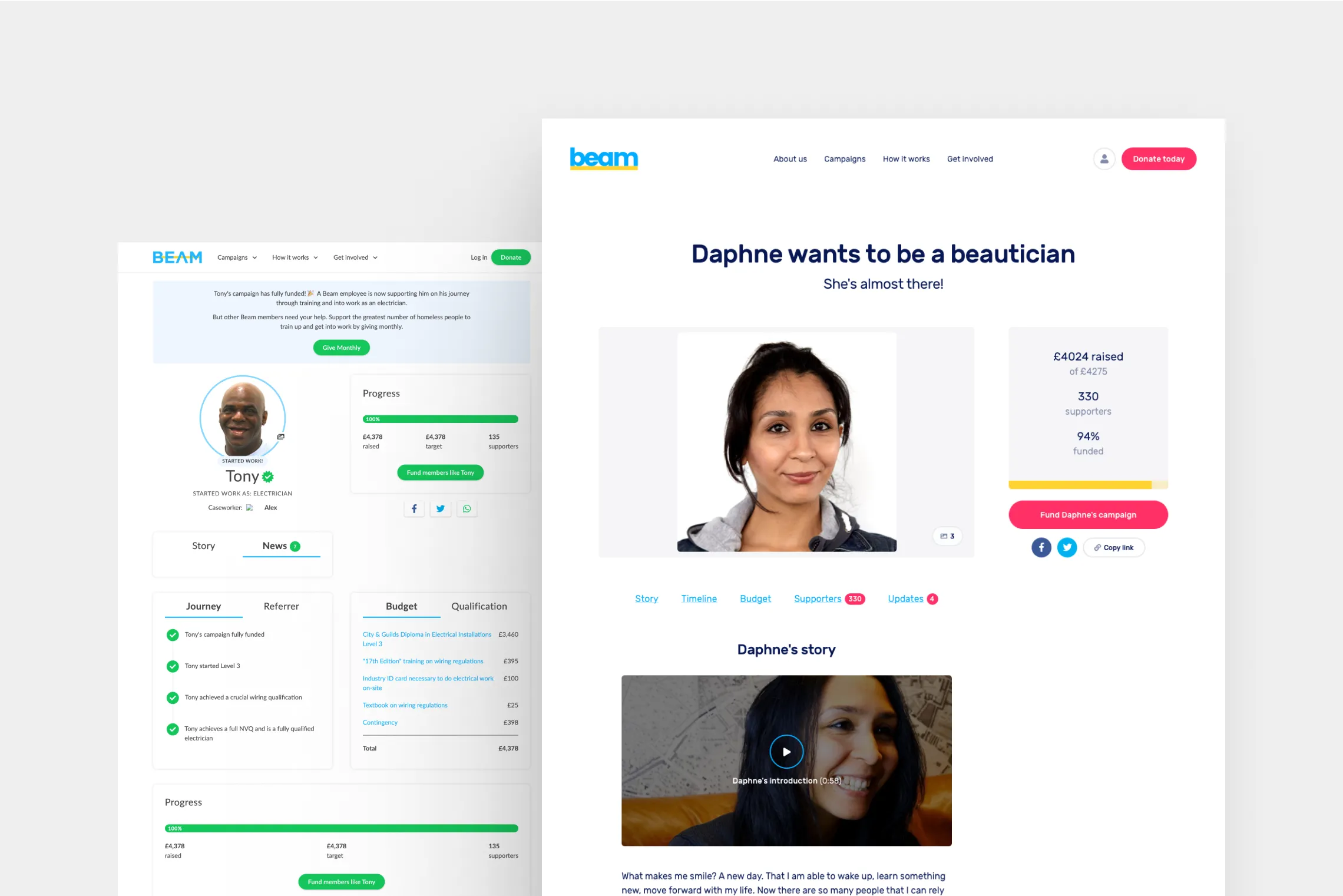
Campaign page — Before & after
The new design for Beam was received well by the user base, who felt it was modern, credible and easy to navigate.
“A very trustworthy looking site.”
“New [homepage] looks a lot more professional and is much more effective.”
“Gives me the feeling I can change someones life.”
“Where I really connect with it is where you show pictures of the people.”
“Very clear how money is going to be spent... good to see other supporters’ comments.”
“Credible & clear.”
Beam continues to support people into stable, paid work to this day, having made great strides in their mission. As of 2023, Beam has supported 1,233 people. 81% find work through their Beam campaign, with 86% of those enjoying sustained employment beyond 3 months.
Beam has also expanded into support for refugees, making them 3 times more likely to secure jobs. You can more about Beam’s incredible impact here:
Campaign page
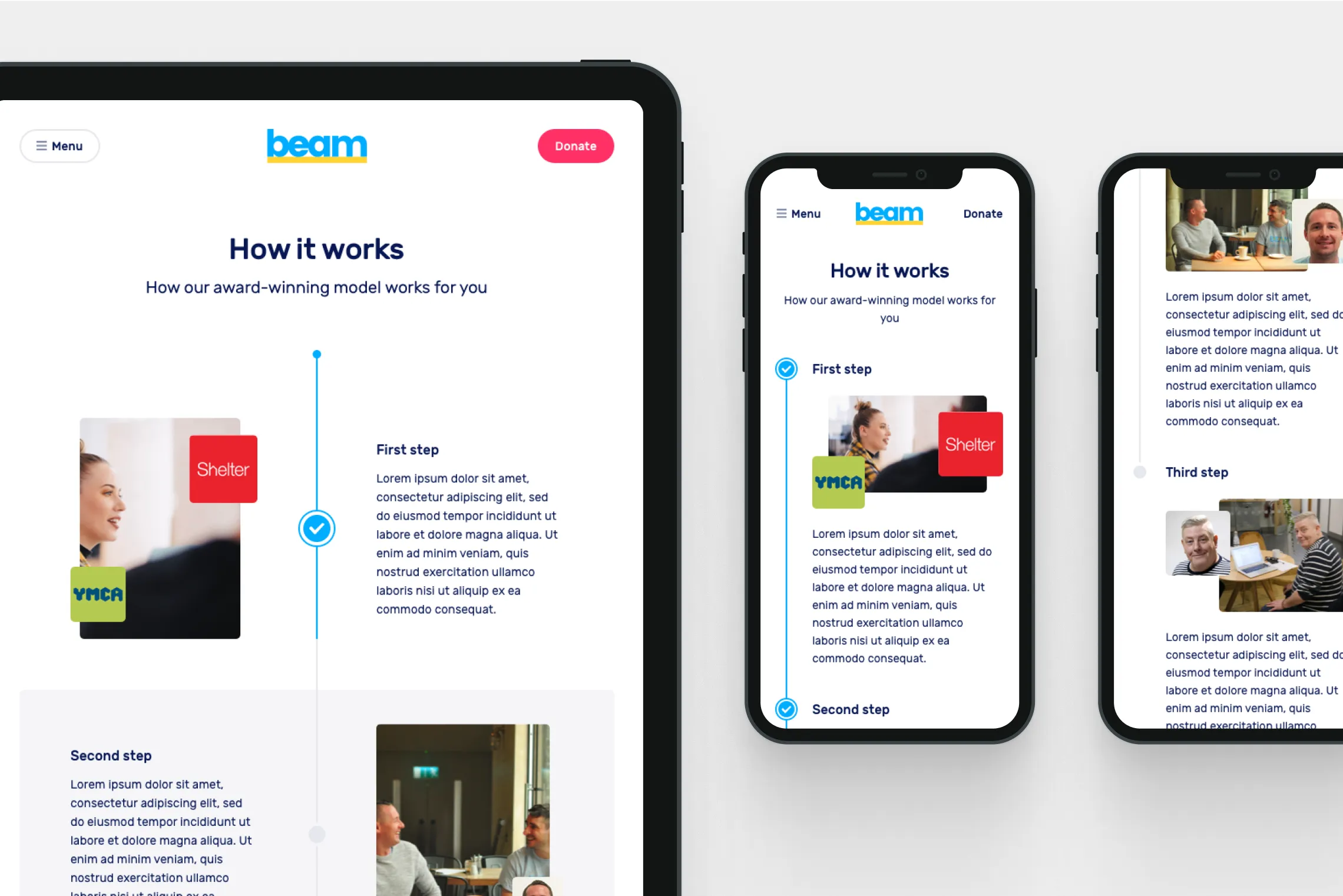
'How it works' page — Mockups
Learnings
Take overly positive feedback with a pinch of salt
People are reticent to be anything but positive about charities, which can lead to problems when running user interviews. Sometimes a reminder is needed that their comments aren’t criticism, but necessary feedback for improvement — a learning that can apply to all user interview situations.
Prototypes are good for research, GREAT for delivery
I made heavy use of prototypes for gathering insights from our user research, but they proved useful early on in giving Julian a cohesive direction for where we were going. The final delivery for build included site-wide prototypes for both desktop and mobile, annotated and explained to help fill in any gaps.
Testimonial
“Sam is a great product designer - genuinely user focused and will instinctively approach product holistically. He also reliably makes great char sui recommendations.”
Tara Bradberry
Product Manager