Tally Money

Tally Money

App design and visual design refresh — 300% user-base boost

Highlights

4,500 new users

300% boost to user base

Project Details

Tally Money is a challenger bank with a unique proposition, offering their own digital currency backed by physical gold as if run by Midas himself. Since launch their app had struggled with low sign-up rates, and user testing showed that the sign-up journey struggled with bugs and inconsistent UX patterns with a large amount of people dropping off during identity verification. Tally had already started addressing this with a project to replace their verification back-end, but wanted to tackle the front-end also.

I redesigned the entire Tally Money app experience, including a new visual direction that complimented their existing brand materials, bringing Tally’s look & feel up to that of their competitors (i’m looking at you Monzo, Starling and Revolut). The new app launched in Jan 2020, in step with a bonus program for new accounts. Within 2 months, Tally Money had an extra 4,500 users — an increase of 300%.

Roles

UI / UX / Prototyping / Branding

Year

2019

Industry

Banking, Fintech

Interactive prototype — give it a click

Research & analysis

Before coming onboard, some initial user testing had been carried out with early adopters of the app. Taking a look at the information collected, a few pain points were apparent:

Inconsistent UX behaviours were causing headaches

”The screens jump around a bit... lots of different layouts. [Inputs] seem to change location for no reason”

Bugs stopped people from signing up, even when they wanted to

“I was trying to sign-up but I didn’t receive a verification email”

The visual design was dark & dated

“Struggling to read bits of it, red text I can’t really see. Everything is quite dark.”

Lack of signposting confused users

“How long does it take to open an account? I got a bit lost when I had to jump around between [the app] and my email”

Wireframes were in progress to address the issues with verification, but they were incomplete and didn’t take into account the lack of signposting or the inconsistency of the UI. The visual design piece had only just begun, but the senior stakeholders were adamant that any new look & feel should be in keeping with the existing brand materials.

On the development side, one thing we had to keep in mind was that resource was limited. The project had only a single developer, and so Supernova.io (then a beta design-to-development solution to generate production-ready React code) was chosen to speed up delivery times, but it was an unknown variable.
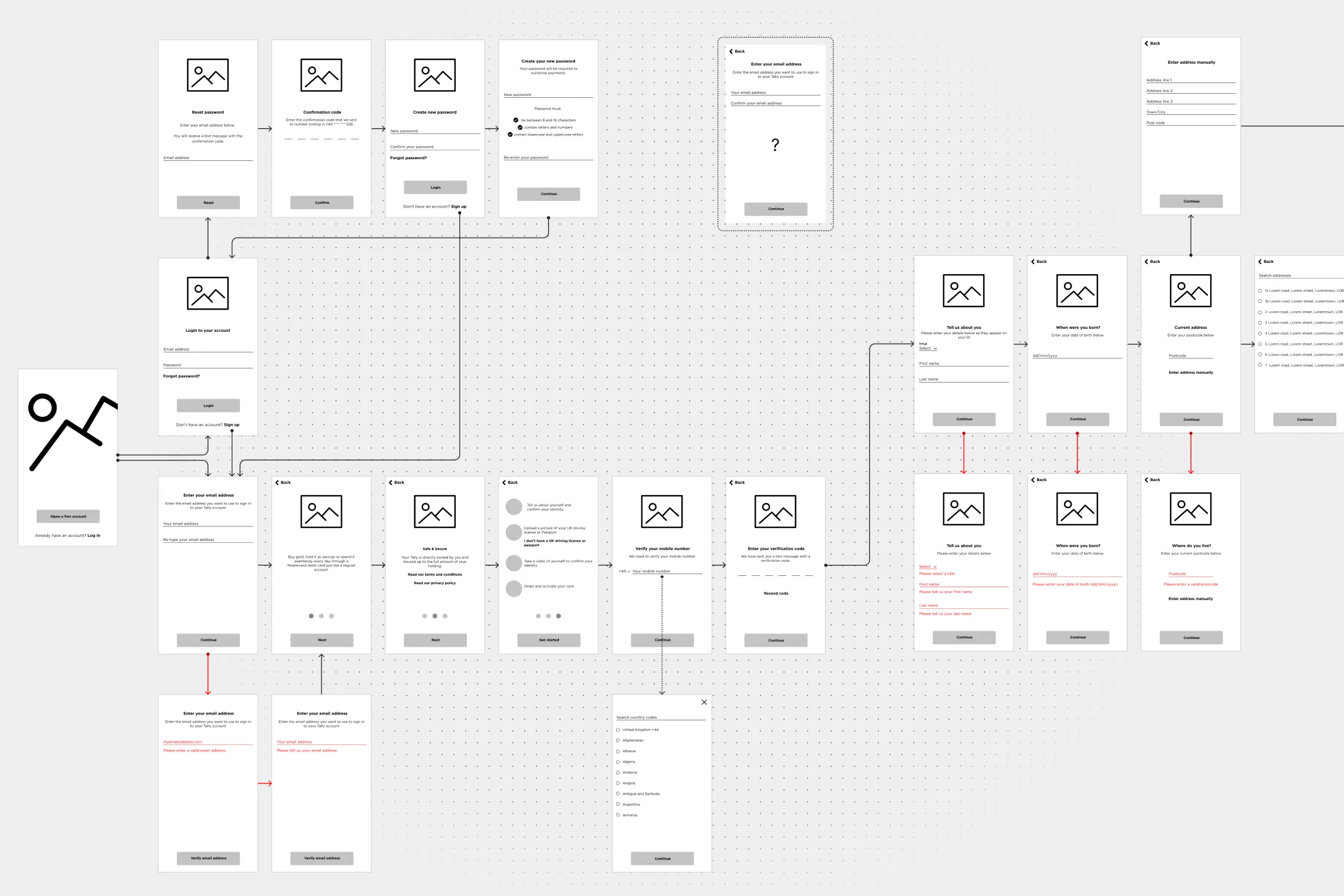
User flows auditing — identifying dead-ends and missing journeys
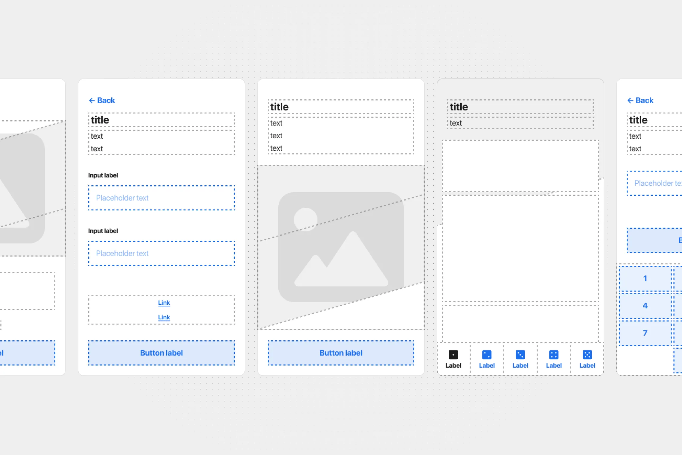
Layouts — a necessary tool for rapid iteration & development
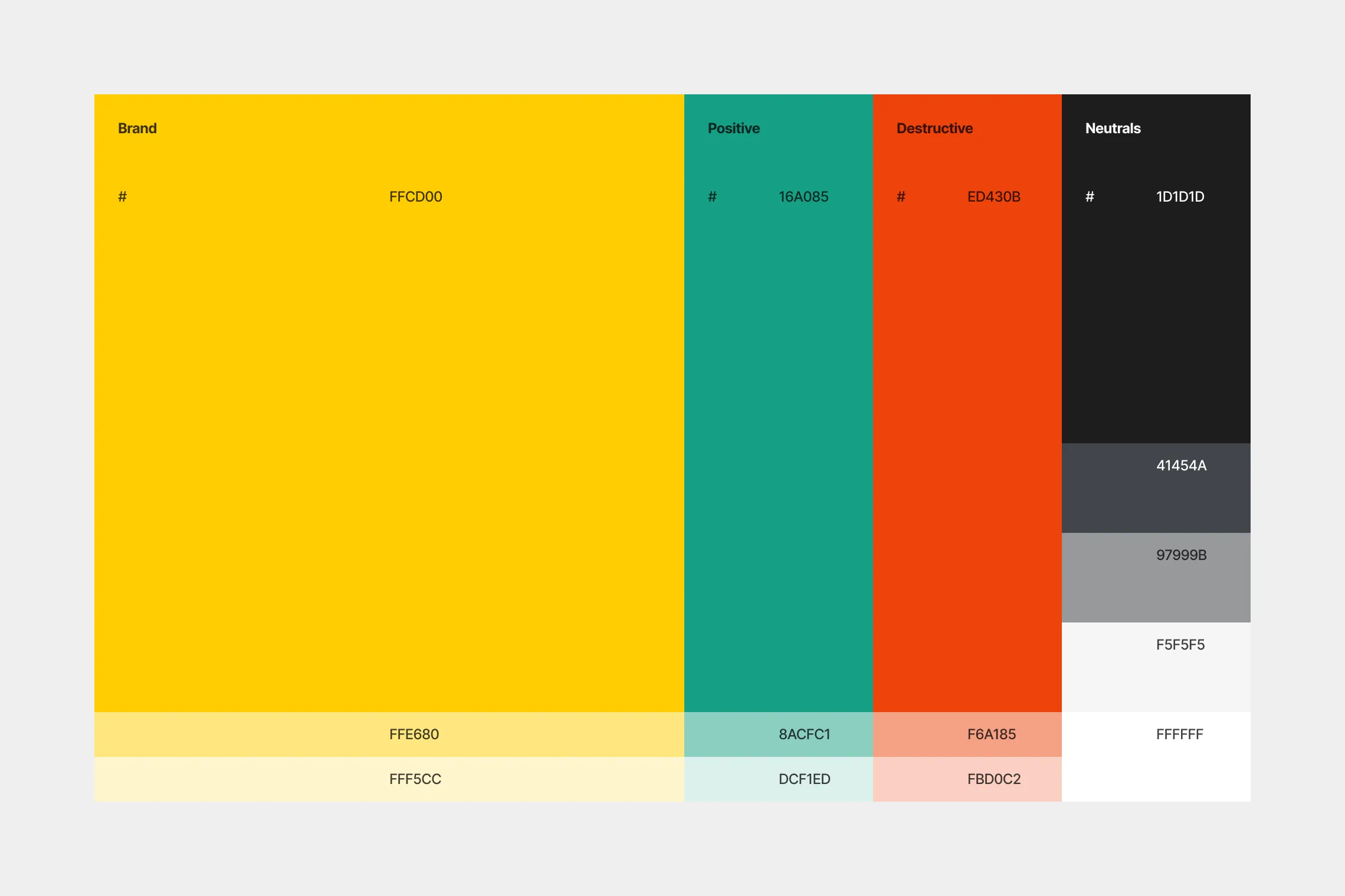
Palette — standardised and expanded, providing a digital friendly guideline for future projects
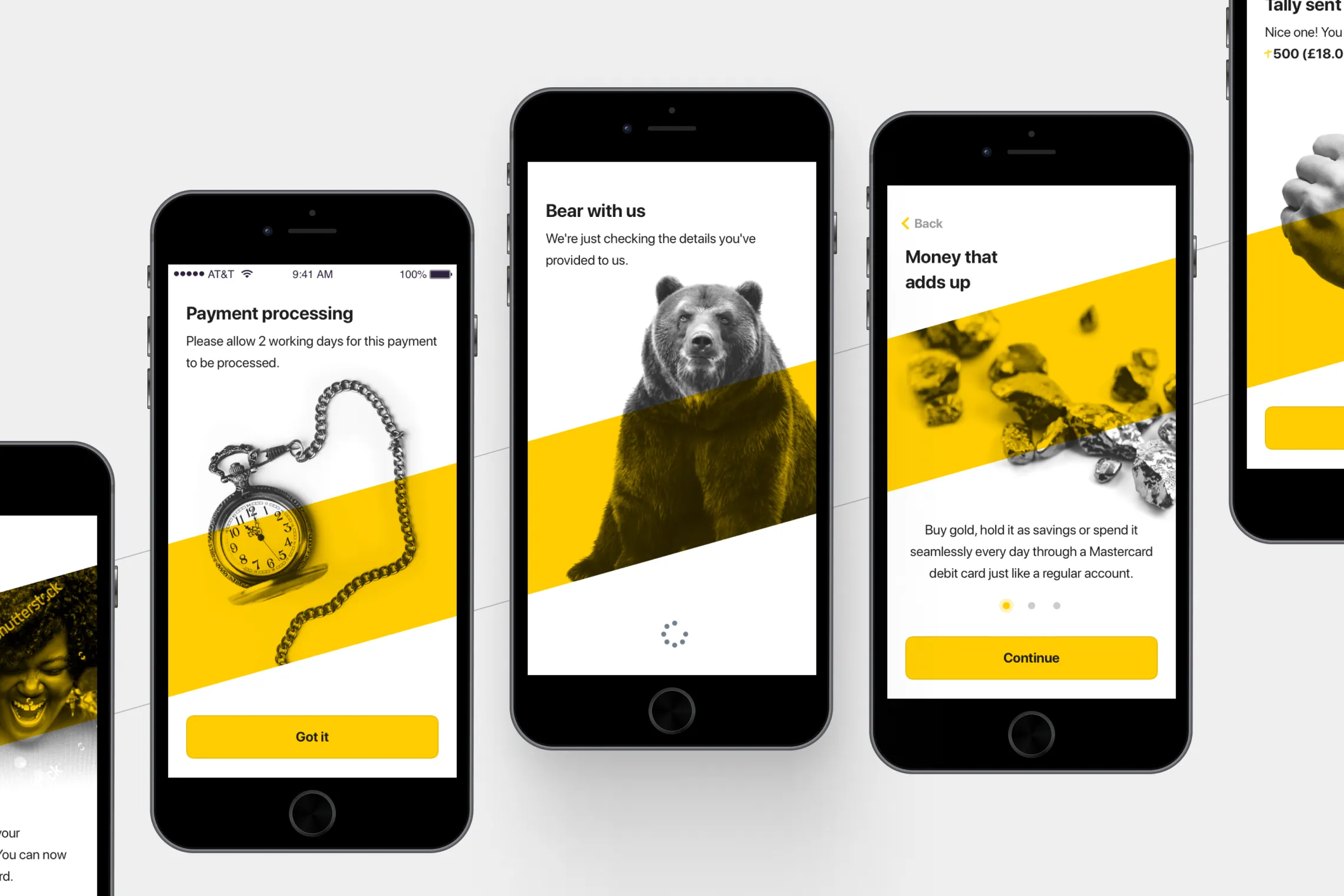
Graphic device examples
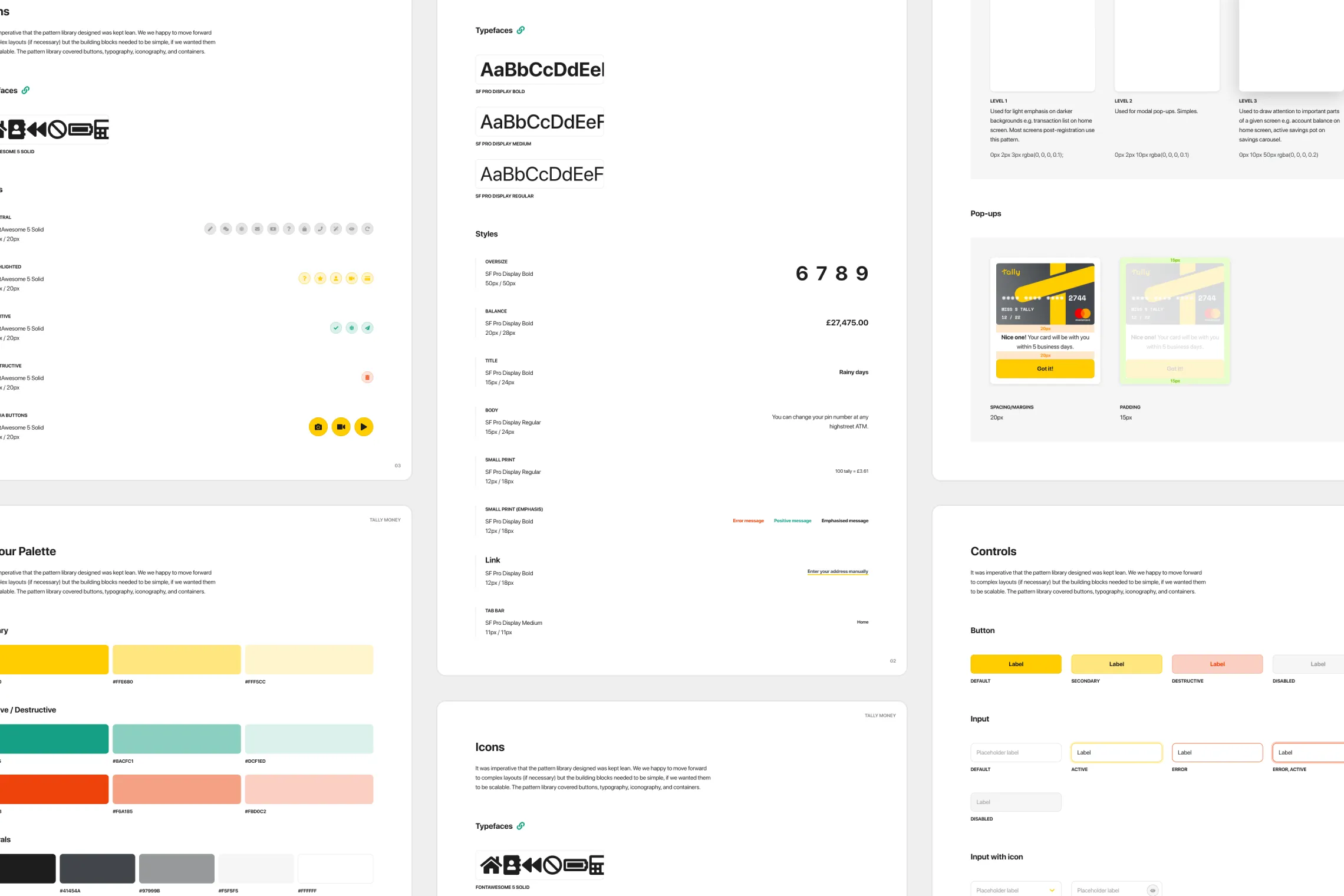
Pattern library & guidelines

Outcomes

97 screens were designed & delivered for the app re-release. An additional 30+, possible through efficient use of templating and a concise pattern library, were produced for ‘Savings pots’ — Tally’s next in-development feature, and a nice-to-have in the project brief. The new app experience was launch in January 2020 alongside a bonus program for new sign-ups, and resulted in over 4,500 new users successfully registered — a jump of over 300% from Tally’s initial user base of 1,500 users.

  • 3 reviews

    GB

    20 Jun 2019

    Excellent app, easy to use and great value for money.

    Completely blown away by how good this is. The app is excellent, intuitive, and user-friendly, even better than my banking app. The sign-up process was seamless and after my first deposit, I made a purchase within a few minutes. 100% recommended.

  • AH

    2 reviews

    GB

    8 Mar 2021

    Downloaded and deposited today

    Downloaded and deposited today. App looks great, easy to use and super slick. The could well change the future of currency.

  • 1 review

    GB

    20 Jun 2019

    Great product with great support

    Great product with great support. Was one of the first to use it in beta testing. It's now a very slick and easy to use account. And to top off, increase in gold values means my ££s are worth more here than a high street account! Get on board and enjoy using gold and Tally for your shopping.

  • MS

    2 reviews

    GB

    8 Mar 2021

    Five Stars

    Absolutely, fantastic. Literally changing the landscape as finance as we know it, I would advise everyone to get the Tally App, especially in these times where it is a great way to hedge against inflation. The app itself is very user friendly and extremely easy to use.

  • 11 reviews

    GB

    7 Feb 2023

    I would recommend Tally to those who…

    I would recommend Tally to those who want to invest in gold, but perhaps don’t have the liquid cash to buy physical gold.

    Tally is an intuitive app and easy to use for anyone who uses a banking app on their phone. Great for long term savers and those who just want to escape the central bank fiat money system.

As a result of this project, Tally are now in a great position to quickly jumpstart new projects & features using the patterns, templates and visual design language available to them in their newly designed toolkit, all for their growing user base.
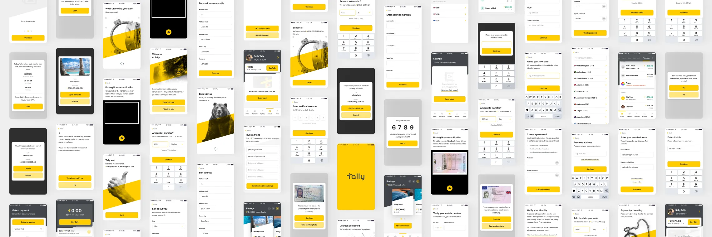
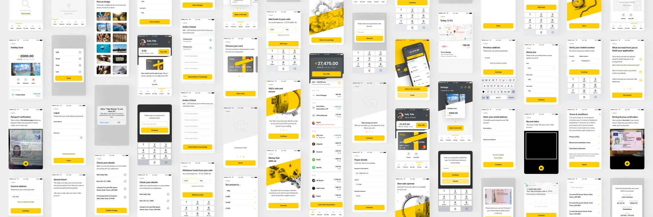
Screens — over 130 in total
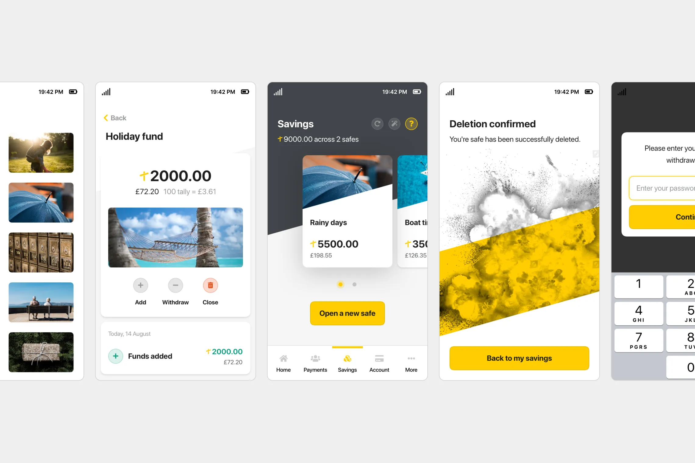
Concept screens for ‘Savings pots’ feature
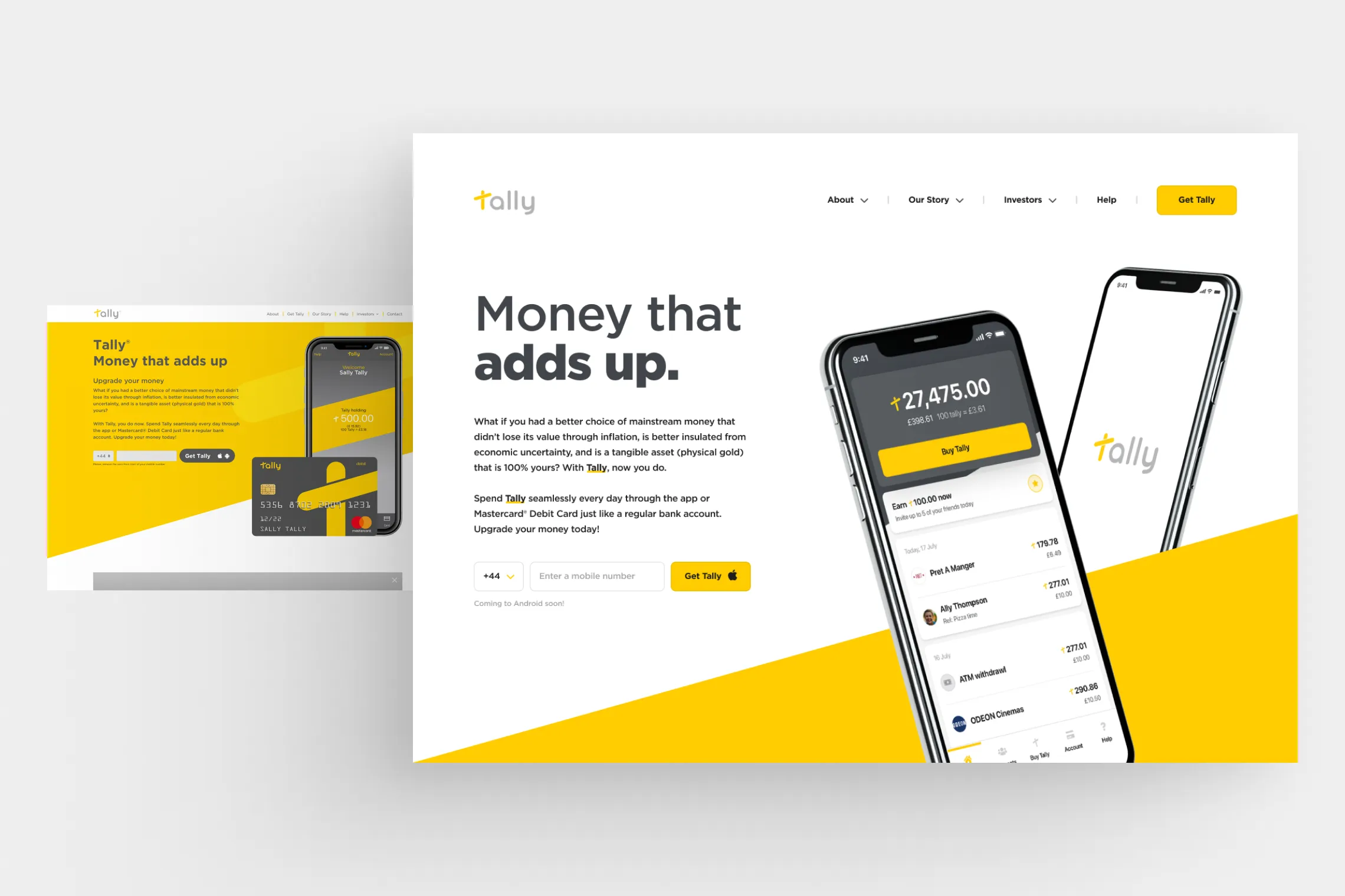
Landing page concept with the updated visual design applied (Left: existing Tally Money website for comparison)

Learnings

Fewer, more flexible patterns are a-OK

Larger design system projects often require context-specific components with high degrees of complexity. For smaller projects with quick turnaround times, look to fewer, more flexible patterns to allow you to move quickly and reduce dev time.

Budget for untested development solutions

The team’s use of an in-beta software solution cost months of extra development time, which could’ve been spent on delivering other projects. There’s no issue with using these sorts of solutions, as long as appropriate testing and scoping is done up front.

Involve stakeholders in the fun

Don’t be afraid of your senior leadership teams. Involve them in workshops and show off your more left-field ideas. They might not always land, but stakeholders can and should be some of your most valued collaborators

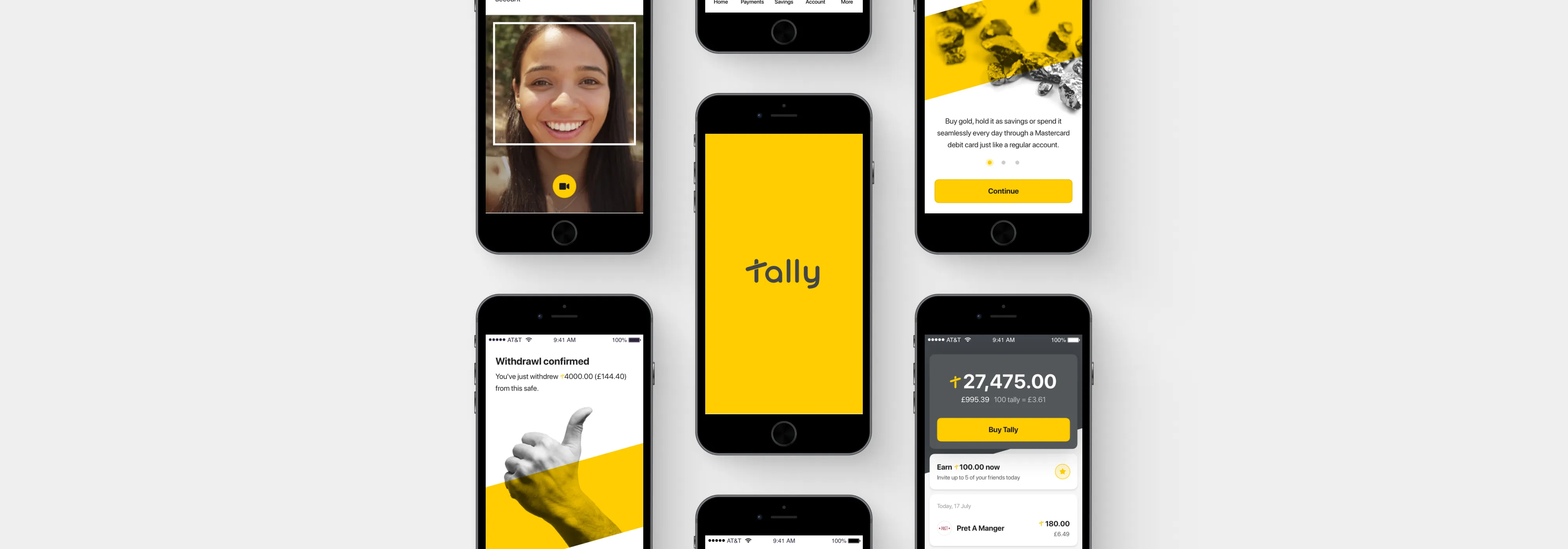
Testimonial

“Sam goes above and beyond, pushing the envelope of creativity and questioning the objectives of a project. He is a fundamental part of any team, paving the way for design standards and acting as a role model. His work is often faultless.”

Damon Macklin

Head of UX

Tally Money

Tally Money

App design and visual design refresh — 300% user-base boost

Highlights

4,500 new users

300% boost to user base

Project Details

Tally Money is a challenger bank with a unique proposition, offering their own digital currency backed by physical gold as if run by Midas himself. Since launch their app had struggled with low sign-up rates, and user testing showed that the sign-up journey struggled with bugs and inconsistent UX patterns with a large amount of people dropping off during identity verification. Tally had already started addressing this with a project to replace their verification back-end, but wanted to tackle the front-end also.

I redesigned the entire Tally Money app experience, including a new visual direction that complimented their existing brand materials, bringing Tally’s look & feel up to that of their competitors (i’m looking at you Monzo, Starling and Revolut). The new app launched in Jan 2020, in step with a bonus program for new accounts. Within 2 months, Tally Money had an extra 4,500 users — an increase of 300%.

Roles

UI / UX / Prototyping / Branding

Year

2019

Industry

Banking, Fintech

Interactive prototype — give it a click

Research & analysis

Before coming onboard, some initial user testing had been carried out with early adopters of the app. Taking a look at the information collected, a few pain points were apparent:

Inconsistent UX behaviours were causing headaches

”The screens jump around a bit... lots of different layouts. [Inputs] seem to change location for no reason”

Bugs stopped people from signing up, even when they wanted to

“I was trying to sign-up but I didn’t receive a verification email”

The visual design was dark & dated

“Struggling to read bits of it, red text I can’t really see. Everything is quite dark.”

Lack of signposting confused users

“How long does it take to open an account? I got a bit lost when I had to jump around between [the app] and my email”

Wireframes were in progress to address the issues with verification, but they were incomplete and didn’t take into account the lack of signposting or the inconsistency of the UI. The visual design piece had only just begun, but the senior stakeholders were adamant that any new look & feel should be in keeping with the existing brand materials.

On the development side, one thing we had to keep in mind was that resource was limited. The project had only a single developer, and so Supernova.io (then a beta design-to-development solution to generate production-ready React code) was chosen to speed up delivery times, but it was an unknown variable.

User flows auditing — identifying dead-ends and missing journeys

Layouts — a necessary tool for rapid iteration & development

Palette — standardised and expanded, providing a digital friendly guideline for future projects

Graphic device examples

Pattern library & guidelines

Outcomes

97 screens were designed & delivered for the app re-release. An additional 30+, possible through efficient use of templating and a concise pattern library, were produced for ‘Savings pots’ — Tally’s next in-development feature, and a nice-to-have in the project brief. The new app experience was launch in January 2020 alongside a bonus program for new sign-ups, and resulted in over 4,500 new users successfully registered — a jump of over 300% from Tally’s initial user base of 1,500 users.

  • 3 reviews

    GB

    20 Jun 2019

    Excellent app, easy to use and great value for money.

    Completely blown away by how good this is. The app is excellent, intuitive, and user-friendly, even better than my banking app. The sign-up process was seamless and after my first deposit, I made a purchase within a few minutes. 100% recommended.

  • AH

    2 reviews

    GB

    8 Mar 2021

    Downloaded and deposited today

    Downloaded and deposited today. App looks great, easy to use and super slick. The could well change the future of currency.

  • 1 review

    GB

    20 Jun 2019

    Great product with great support

    Great product with great support. Was one of the first to use it in beta testing. It's now a very slick and easy to use account. And to top off, increase in gold values means my ££s are worth more here than a high street account! Get on board and enjoy using gold and Tally for your shopping.

  • MS

    2 reviews

    GB

    8 Mar 2021

    Five Stars

    Absolutely, fantastic. Literally changing the landscape as finance as we know it, I would advise everyone to get the Tally App, especially in these times where it is a great way to hedge against inflation. The app itself is very user friendly and extremely easy to use.

  • 11 reviews

    GB

    7 Feb 2023

    I would recommend Tally to those who…

    I would recommend Tally to those who want to invest in gold, but perhaps don’t have the liquid cash to buy physical gold.

    Tally is an intuitive app and easy to use for anyone who uses a banking app on their phone. Great for long term savers and those who just want to escape the central bank fiat money system.

As a result of this project, Tally are now in a great position to quickly jumpstart new projects & features using the patterns, templates and visual design language available to them in their newly designed toolkit, all for their growing user base.

Screens — over 130 in total

Concept screens for ‘Savings pots’ feature

Landing page concept with the updated visual design applied (Left: existing Tally Money website for comparison)

Learnings

Fewer, more flexible patterns are a-OK

Larger design system projects often require context-specific components with high degrees of complexity. For smaller projects with quick turnaround times, look to fewer, more flexible patterns to allow you to move quickly and reduce dev time.

Budget for untested development solutions

The team’s use of an in-beta software solution cost months of extra development time, which could’ve been spent on delivering other projects. There’s no issue with using these sorts of solutions, as long as appropriate testing and scoping is done up front.

Involve stakeholders in the fun

Don’t be afraid of your senior leadership teams. Involve them in workshops and show off your more left-field ideas. They might not always land, but stakeholders can and should be some of your most valued collaborators

Testimonial

“Sam goes above and beyond, pushing the envelope of creativity and questioning the objectives of a project. He is a fundamental part of any team, paving the way for design standards and acting as a role model. His work is often faultless.”

Damon Macklin

Head of UX

Read next

Meta

Human-centred design for Meta's engineering tools & infrastructure design system

Meta

Human-centred design for Meta's engineering tools & infrastructure design system

Beam.org

Beam

Complete platform re-design, new visual identity & brand guidelines

Beam.org

Beam

Complete platform re-design, new visual identity & brand guidelines