BrandCap
Re-design using existing visual language, with development in Wordpress
Highlights
Entire site built in Wordpress/Semplice
Super fast 2 week turnaround
Project Details
BrandCap were a global next-generation business consultancy & creative agency. I came onboard to revive a stalling re-launch of their website, based on a large suite of unfinished concepts & legacy brand material.
I had previously collaborated with BrandCap on the client-side during my tenure with Sparrho, notably with Creative Strategist Janko Matic. He reached out and asked me to join the project to help the team get it across the finish line. I designed the new website with an emphasis on visual consistency, ensuring it was optimised for rapid development.
The project tackled the consolidation of over 40 different mockups from existing redesigns and brand assets, synthesising them into a workable set of deliverables before then building the site in Semplice (a Wordpress site builder).
Roles
UI / UX / Prototyping / Development / Project Mgmt.
Year
2018
Team
Industry
Agency
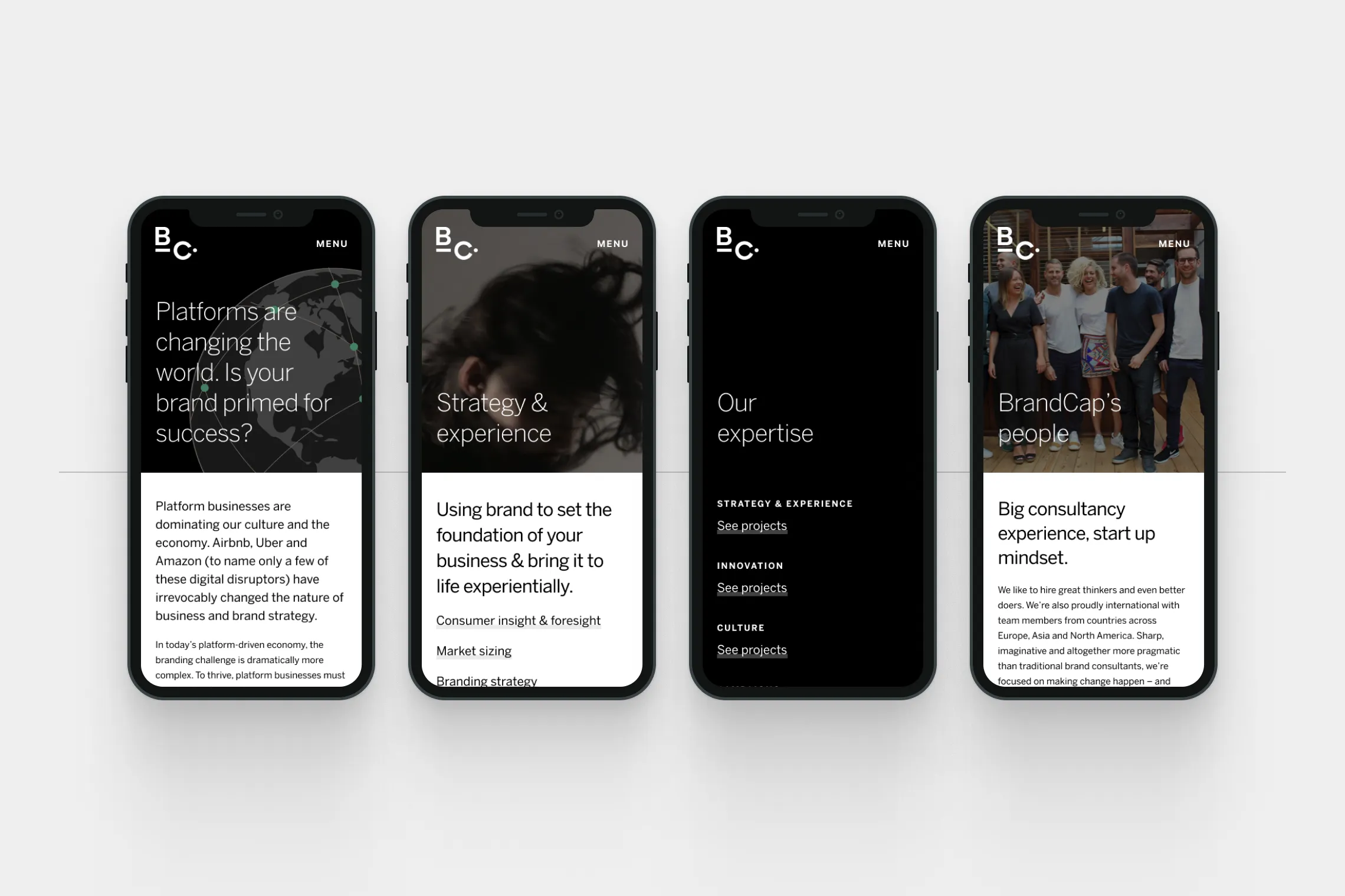
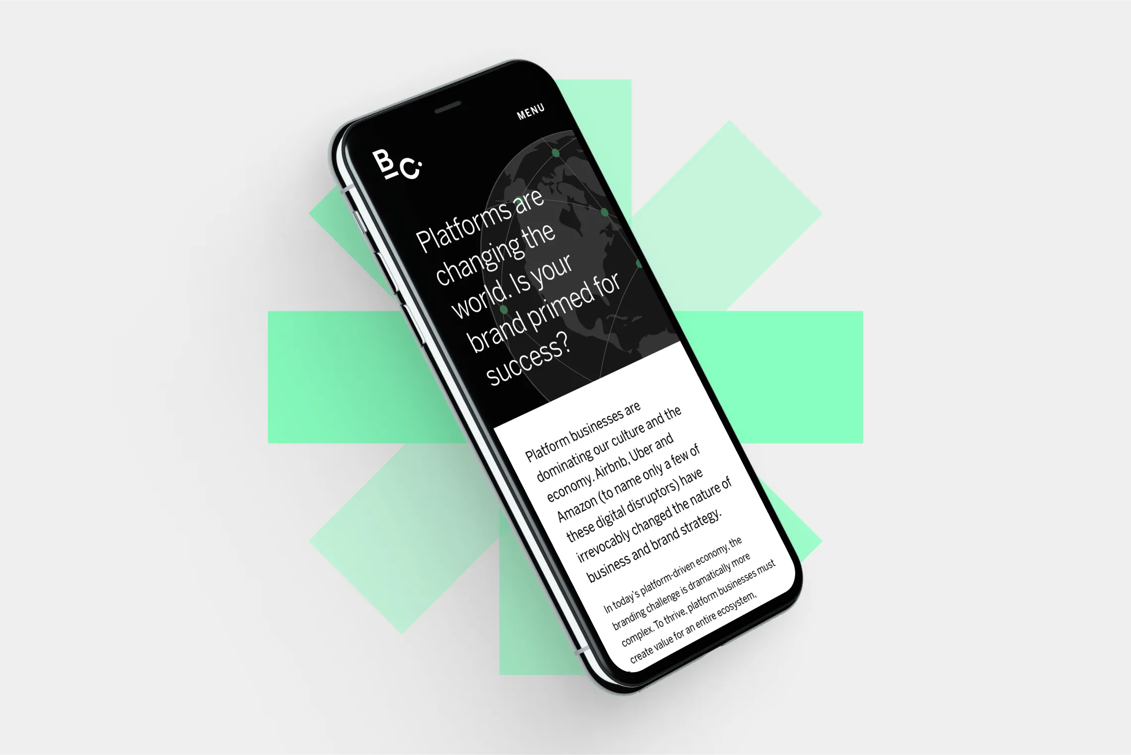
Mobile mockups
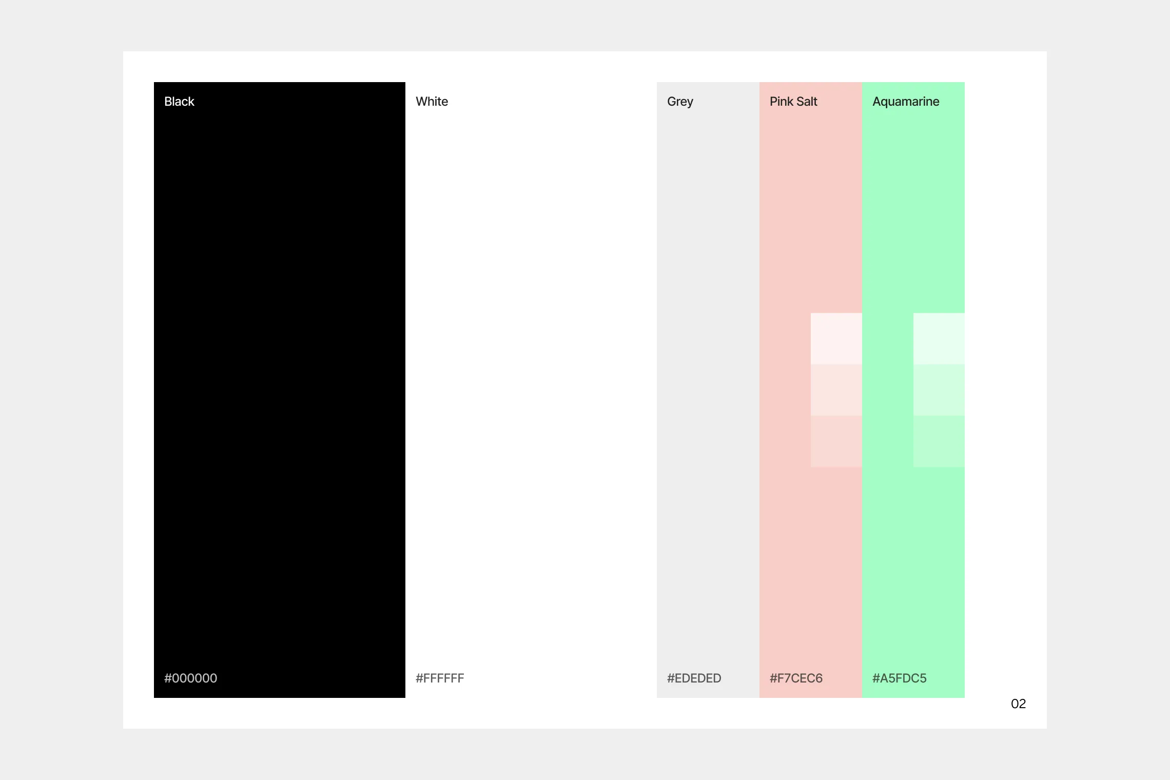
Standardised palette
Design & approach
Working with those familiar with the previous attempts to launch the new site I ran an audit of the pre-existing concepts & clarified any internal requirements that had arisen. As part of this I was supplied with over 40 different desktop page designs, coupled with visual elements from two previous branding exercises (one by Neon Creative, another by londonfatcat).
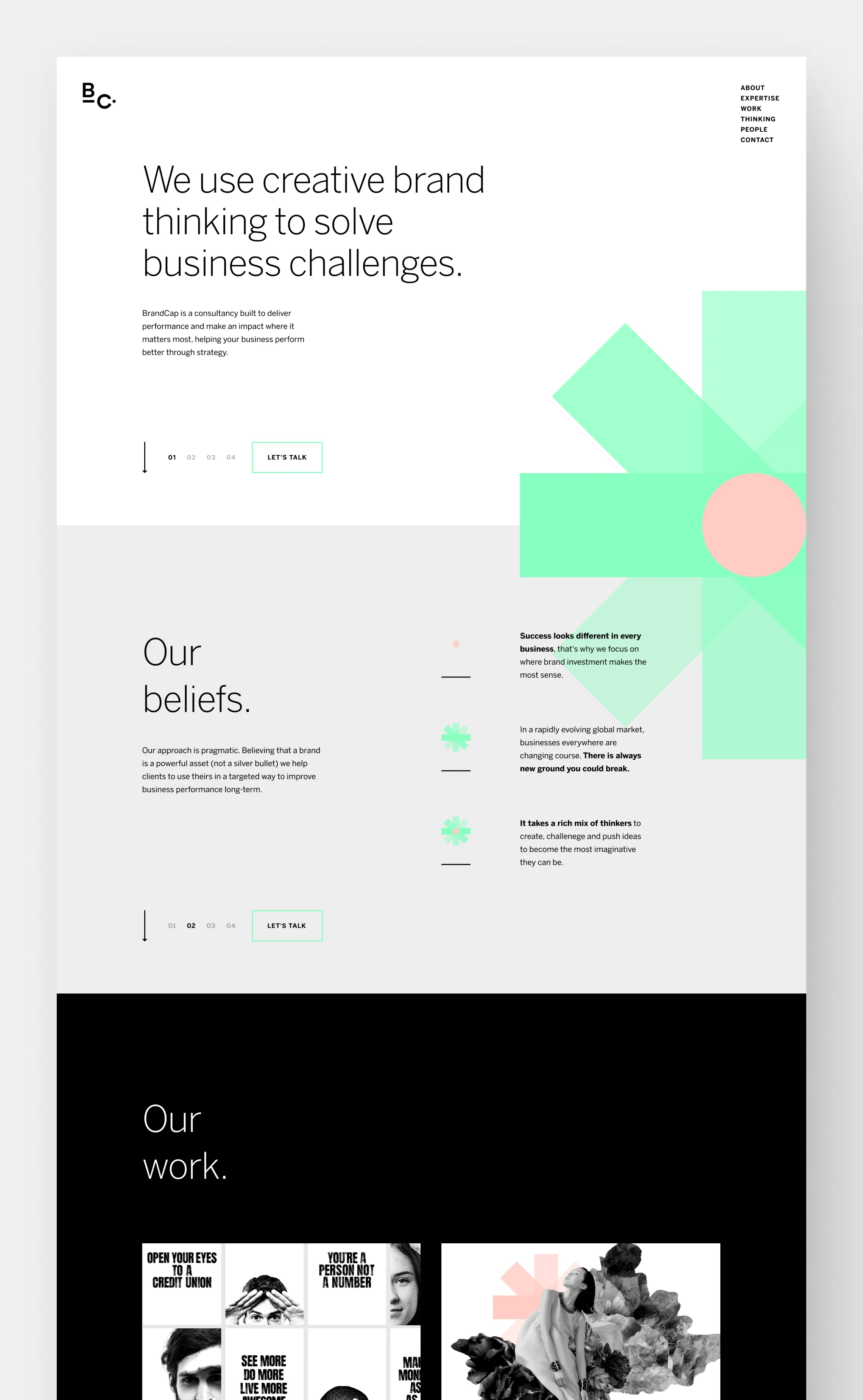
The success of the project hinged on a major reduction in variety. For example, I ruthlessly trimmed down the number of typography styles being used across the existing concepts (almost 30 in number), contributing to a consistent look & feel for the new pages. This approach also made it much easier to provide responsive and build-friendly designs, which could be developed quickly.
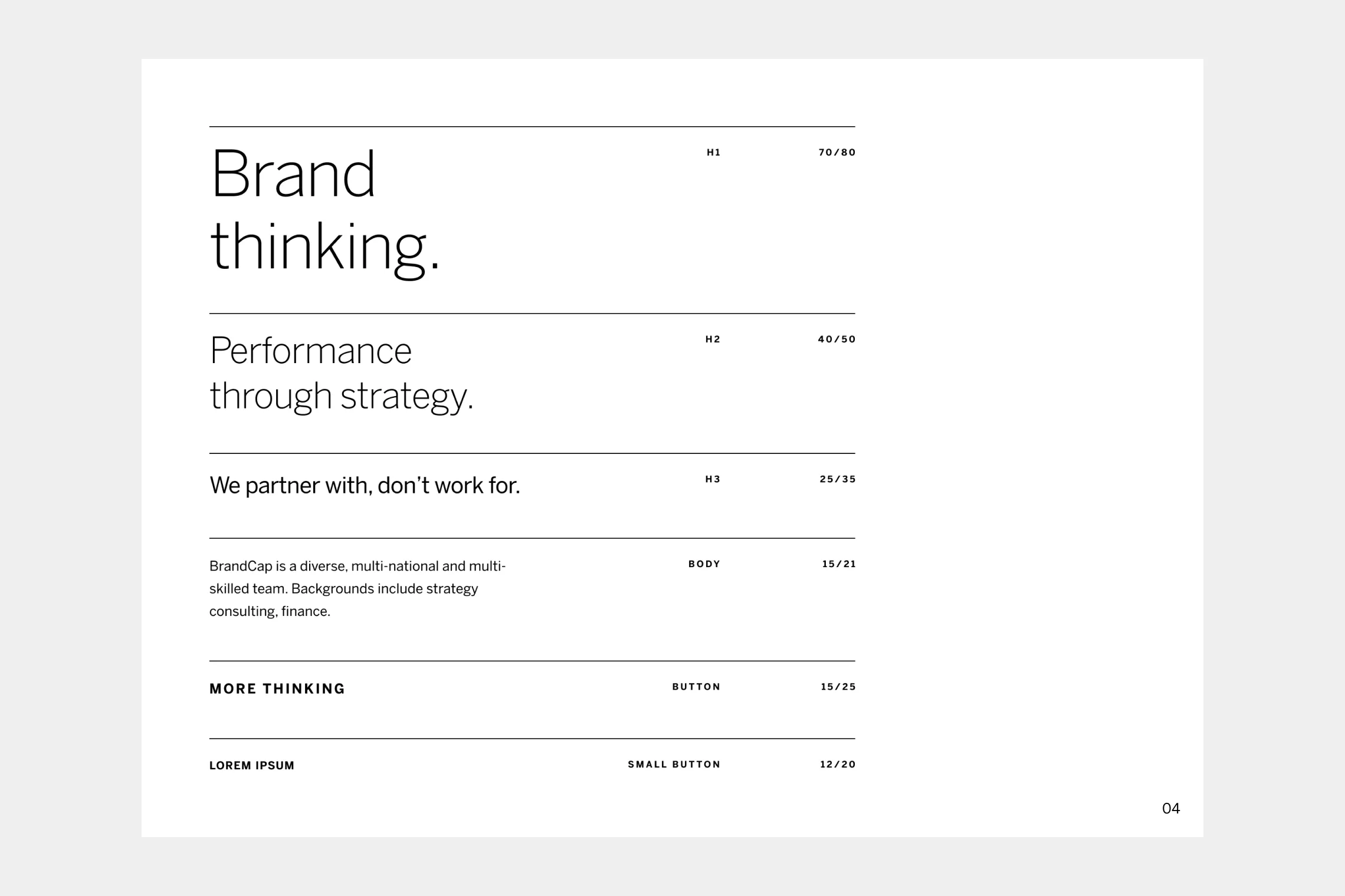
Simple typography set
Landing page
Outcomes
By the end of the project, I had delivered:
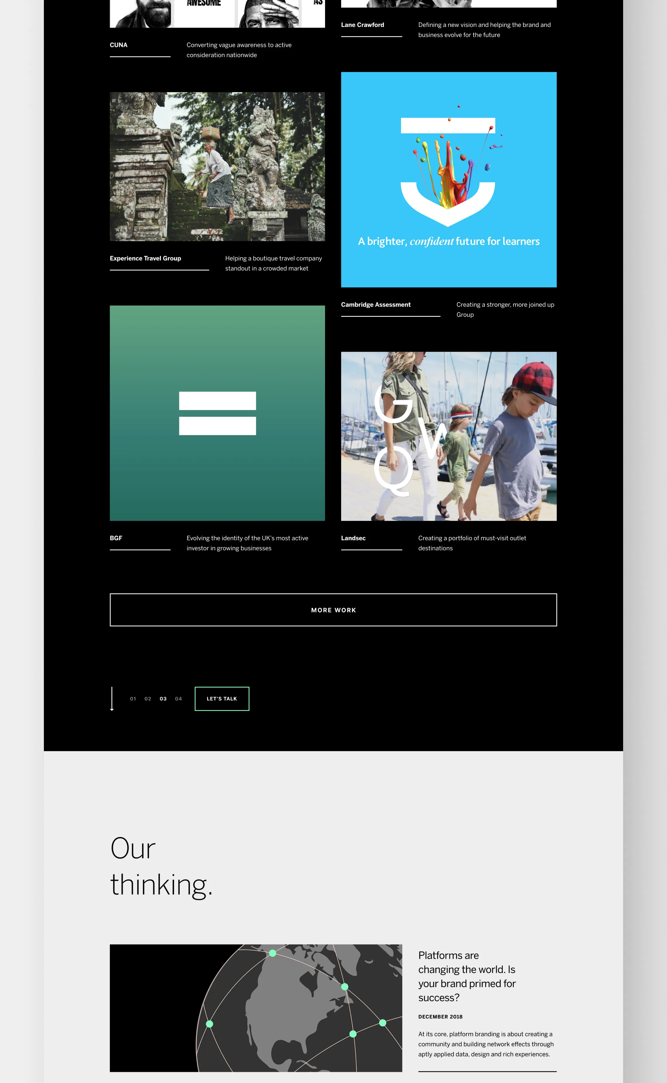
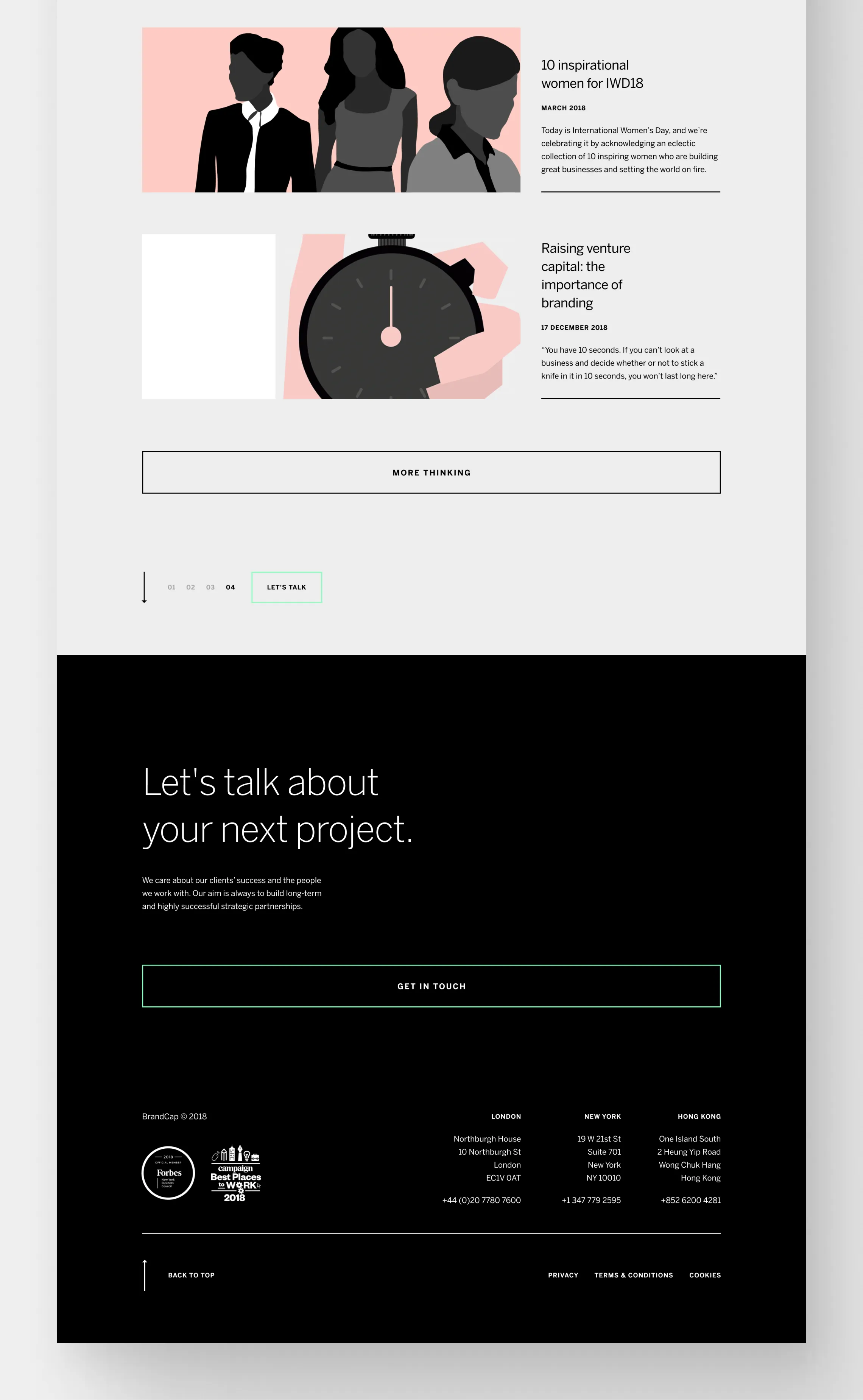
10 responsive designs for the major pages of BrandCap.com, as well typography & palette revisions, delivered via Zeplin.
The above pages developed with dummy content in Semplice, to allow the BrandCap team to easily update both the content & design if needed.
A board of tasks, including both those done by me during my time with the team, as well as those needed to complete the project, annotated and assigned via Notion.
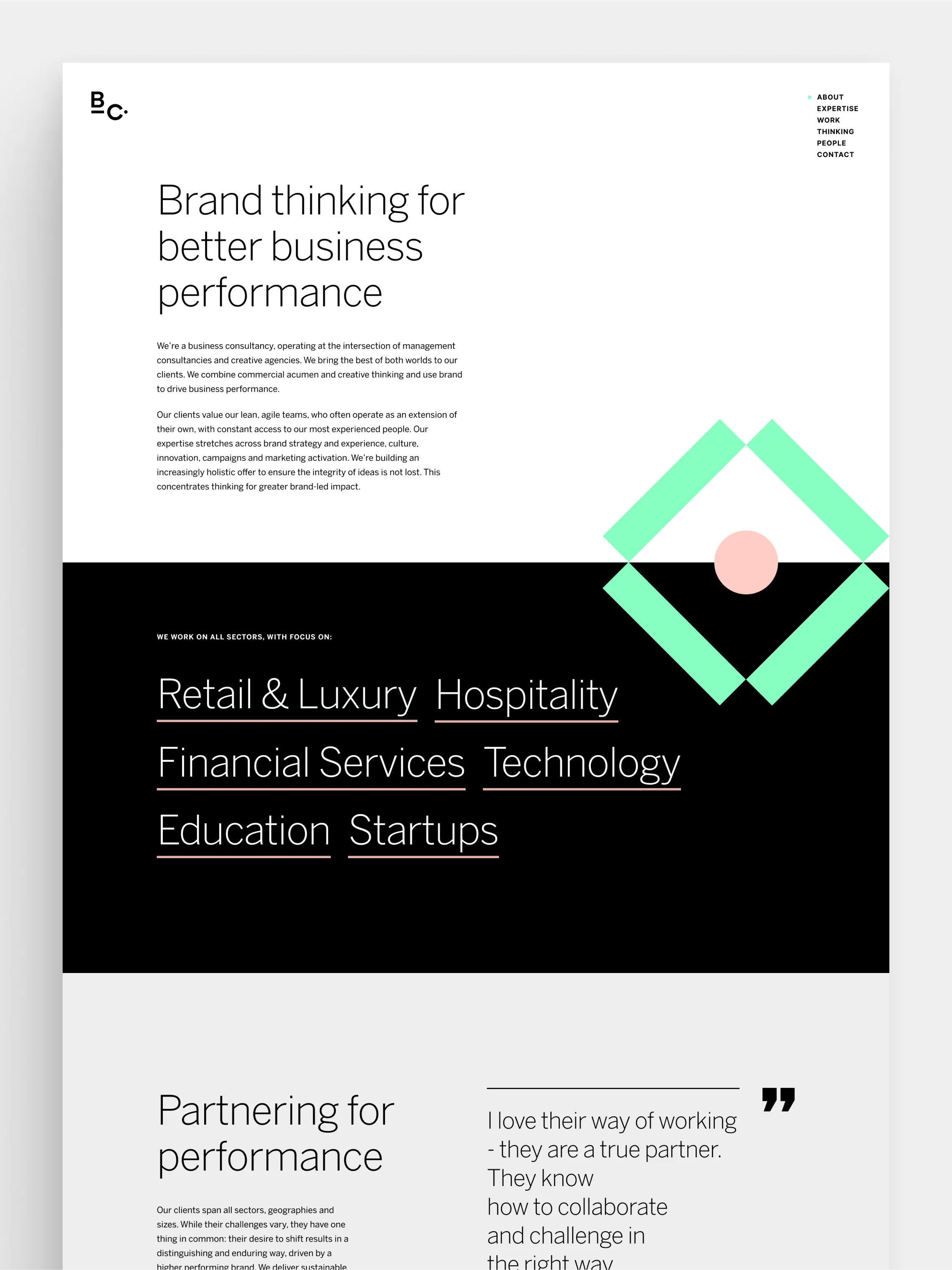
About page
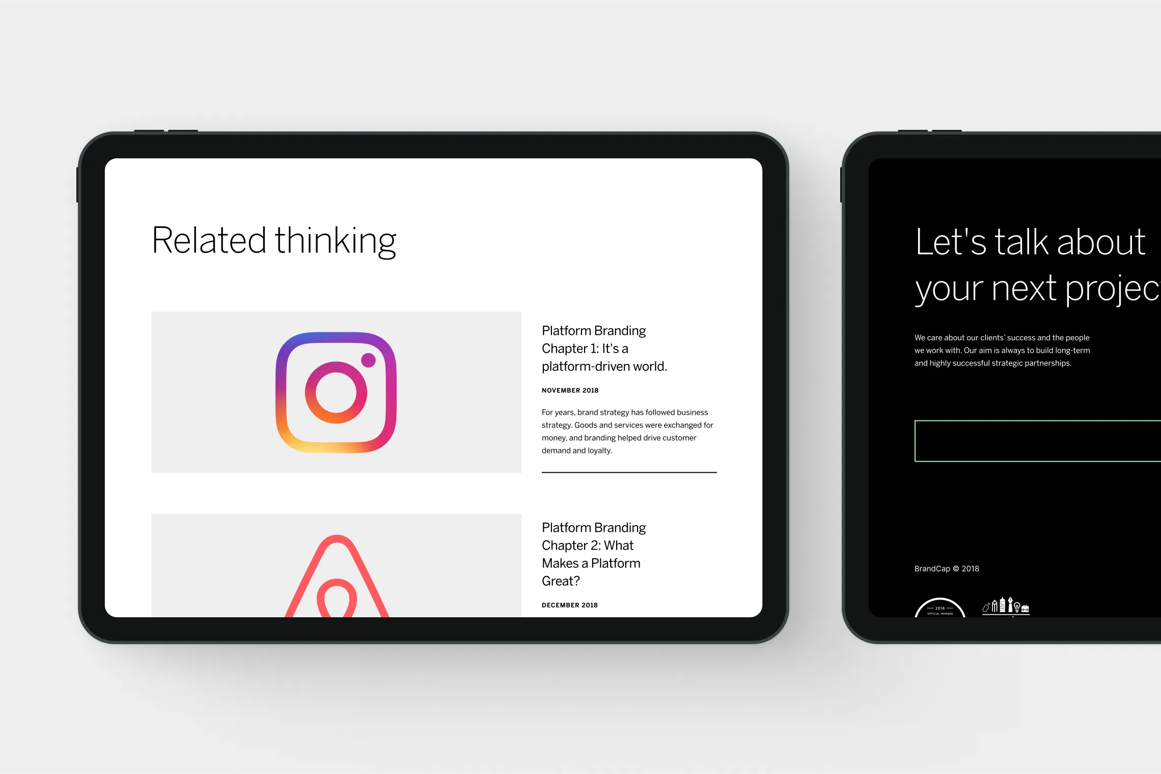
Tablet mockups
Learnings
For some businesses, consolidation trumps re-invention
My time with BrandCap was a useful exercise in learning how to consolidate existing material. As designers, it’s all too compelling to get wrapped up with our big ideas, jumping in to start anew. However, that’s often not the most business-friendly solution, and risks introducing more problems / delays.
Being able to navigate others work and deliver a project that had been stalling for well over a year was a satisfying exercise, and proved much more valuable to the BrandCap folks than starting over fresh for the umpteenth time*.
*Until they changed their mind and rebranding entirely to become Yonder Consulting. Oop.


