SalaryFinance

SalaryFinance

Responsive microsite designed & developed to help people understand their finances

Highlights

Built & launched in 4 weeks

80+ articles

Project Details

SalaryFinance help people improve their financial health through employee-focussed salary sacrifice schemes. In 2016 the team set about to diversify their product line by launching a full-responsive microsite aimed at helping people better understand their finances, in partnership with the Money Advice Service (now MoneyHelper).

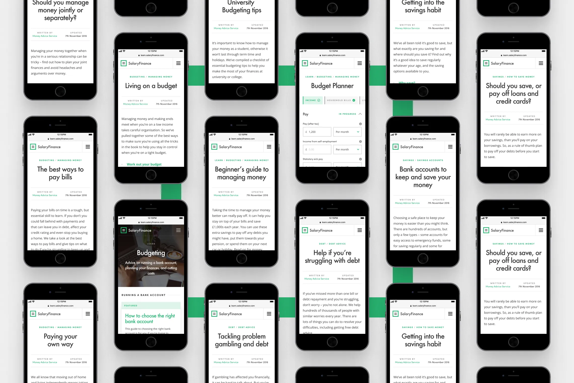
For the project I provided high-fidelity wire-framing, visual design, and HTML / CSS development (using Bootstrap). I also expanded & refined the existing Salary Finance brand assets, as well as explored the taxonomy of their navigation, offering insight into how to evolve their primary site alongside the new platform.

The platform was successfully launched within a month, with over 80 articles, 3 financial tools, and the first in a series of animations produced in-house.

Roles

UI / UX / Prototyping / Development

Year

2016

Industry

Fintech / Publishing
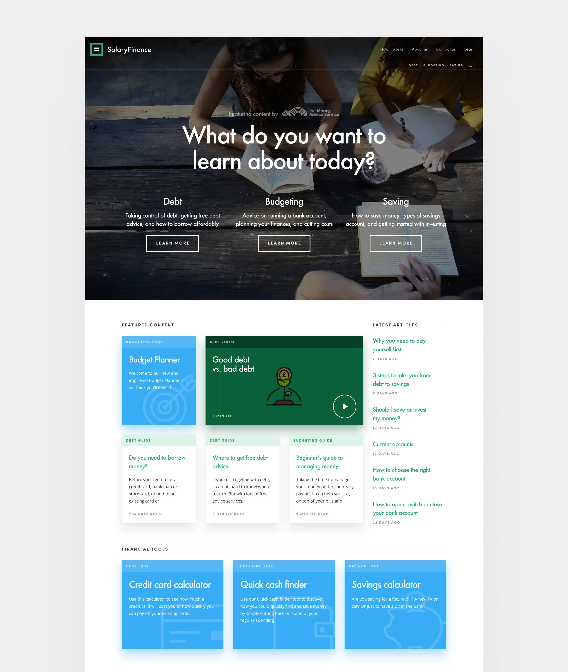
Landing page
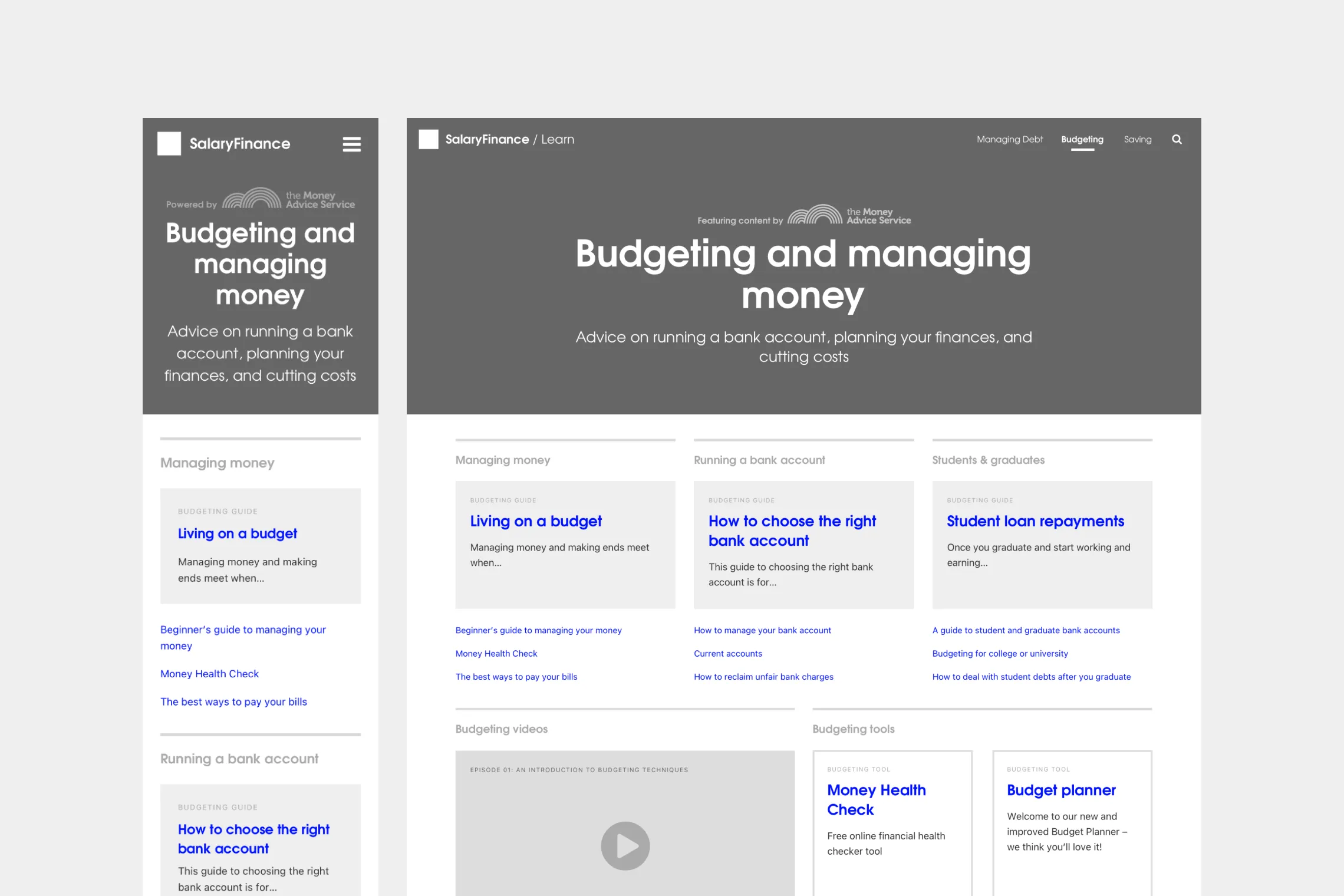
Wireframes — Category page
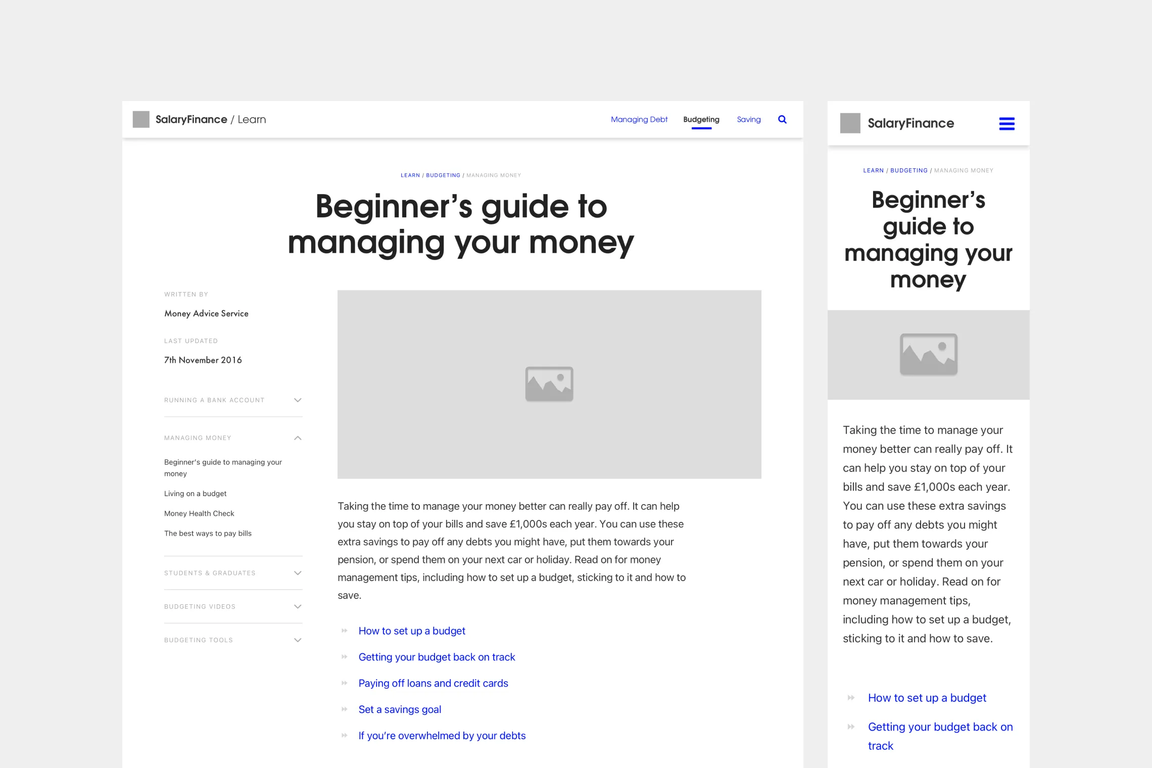
Wireframes — Article page
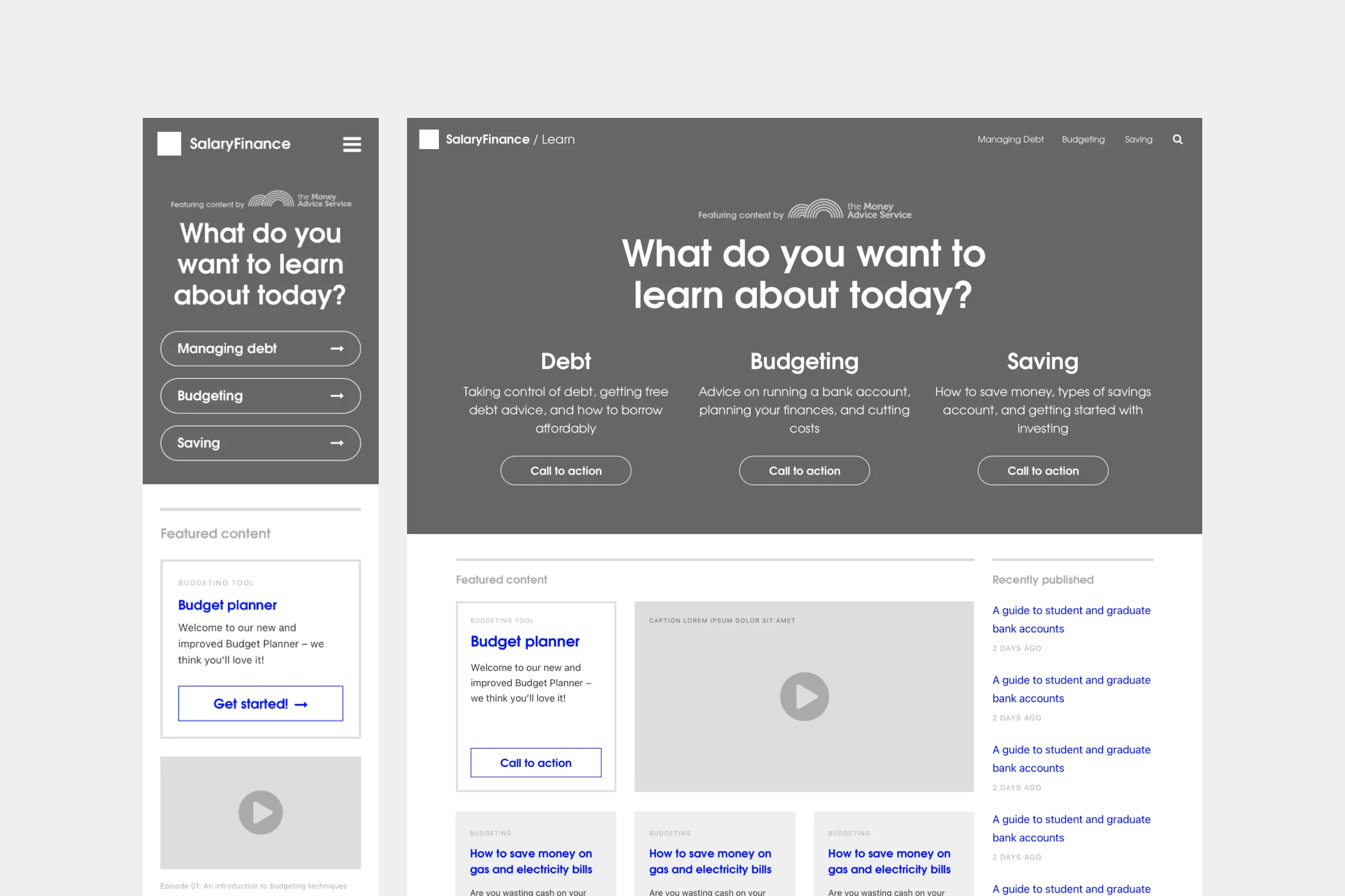
Wireframes — Landing page
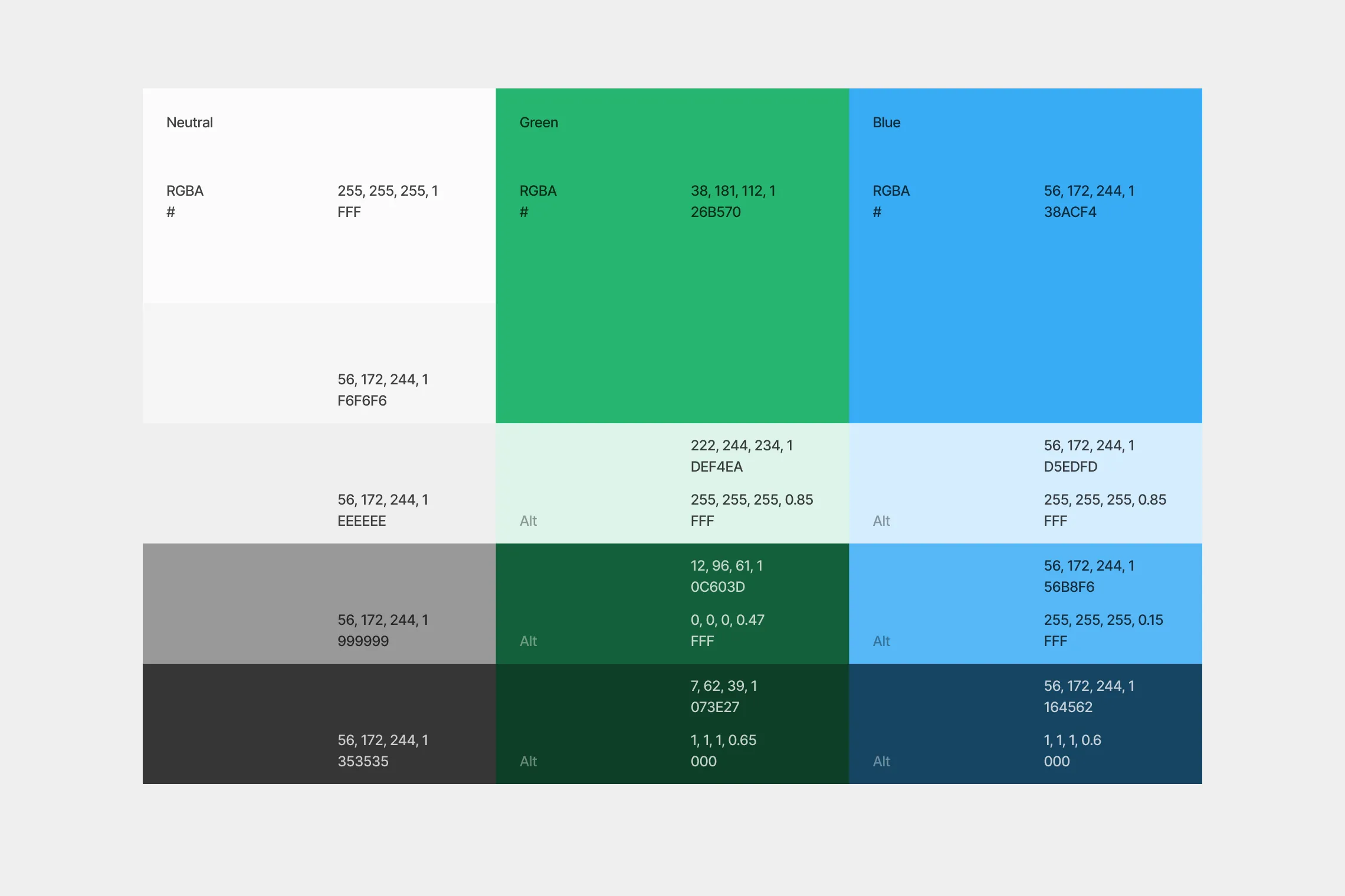
Expanded palette
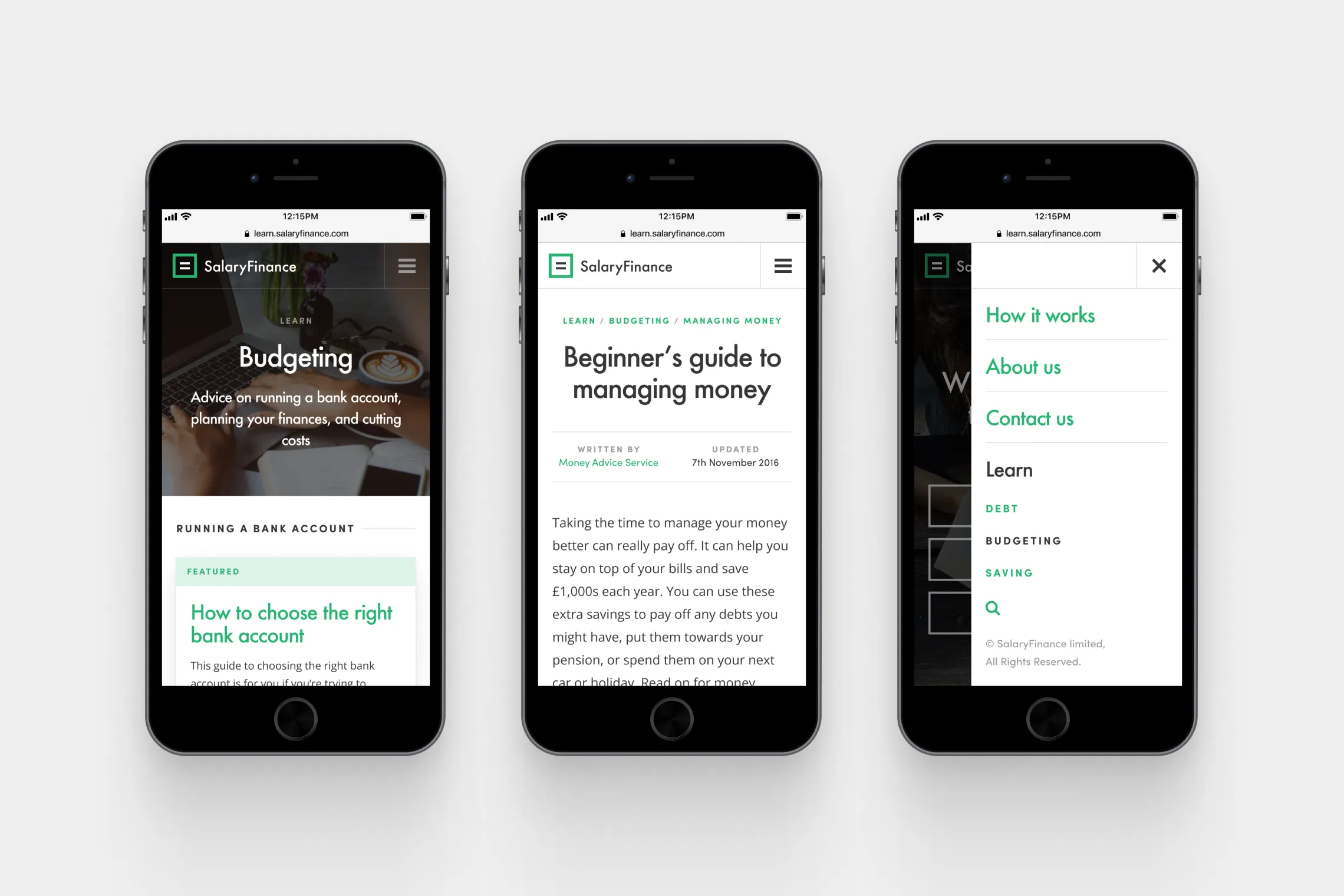
Mobile mockups
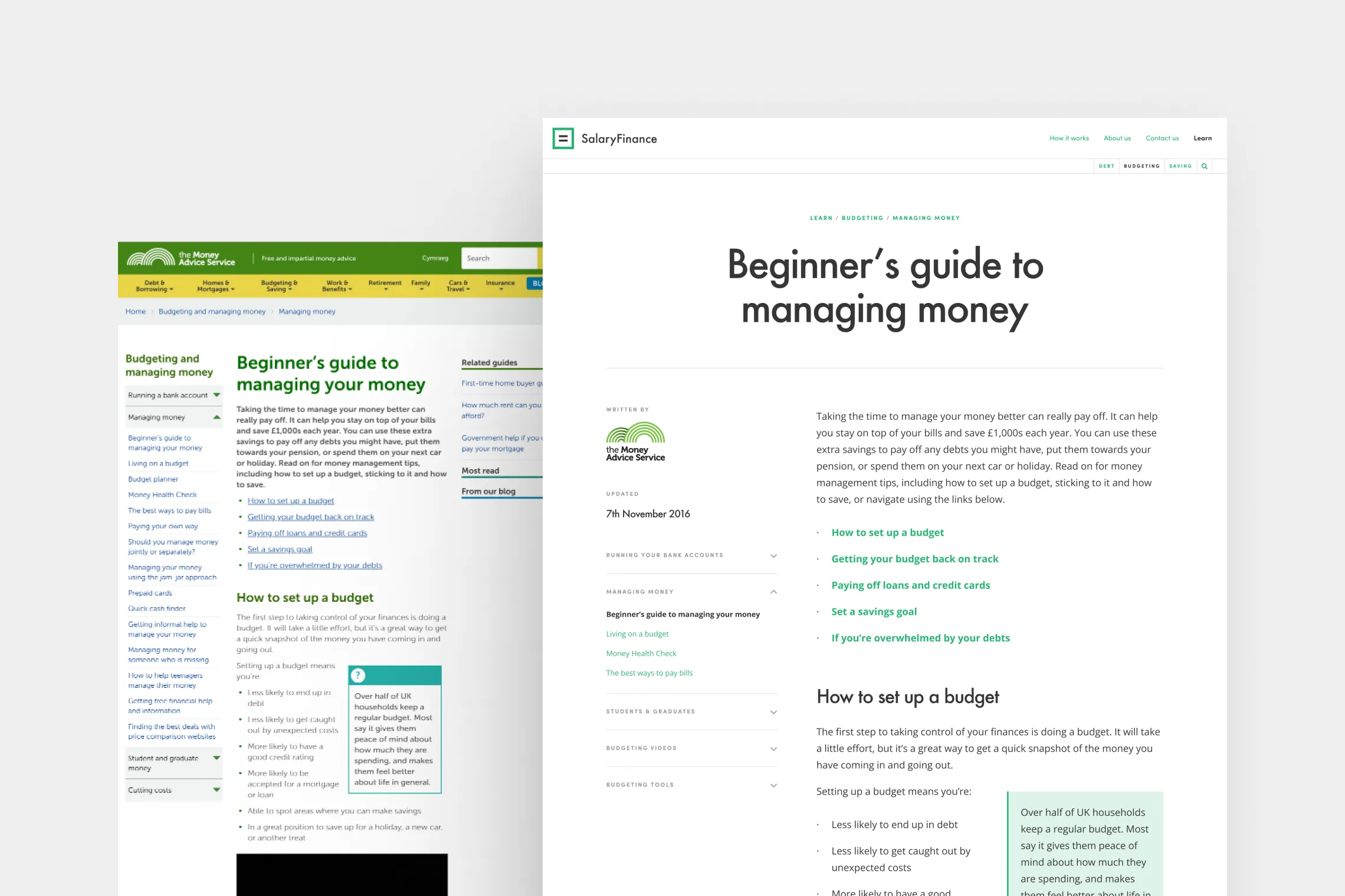
Article page — Before & after
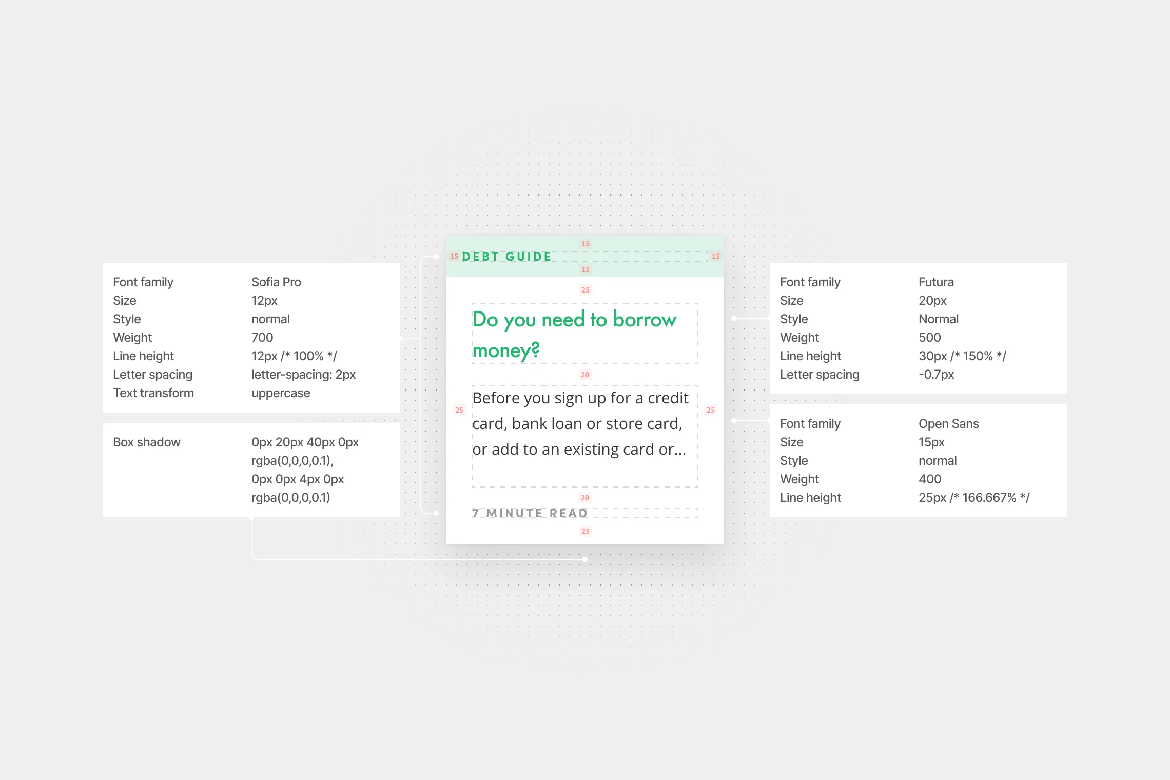
Card construction
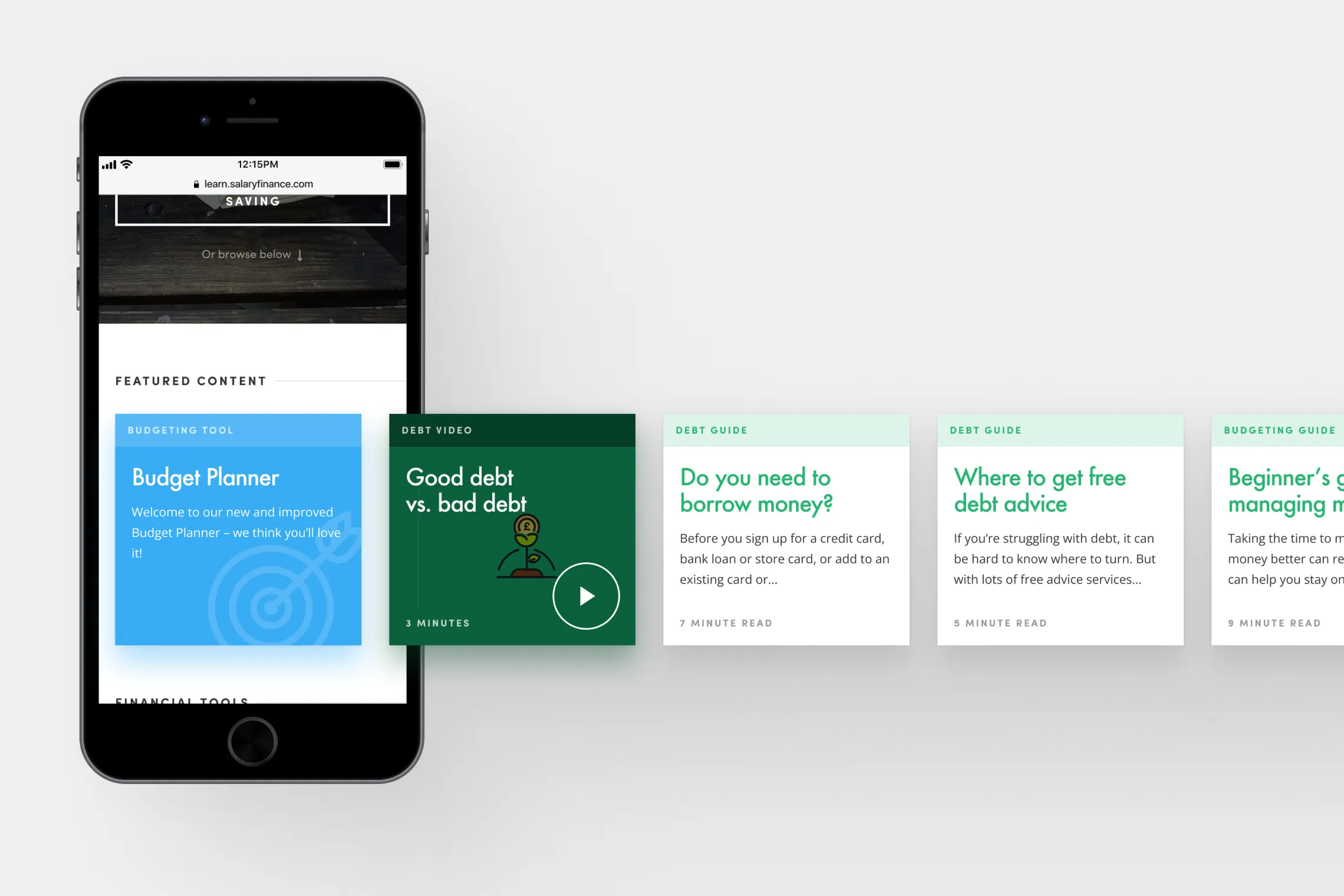
Horizontal scrolling behaviour
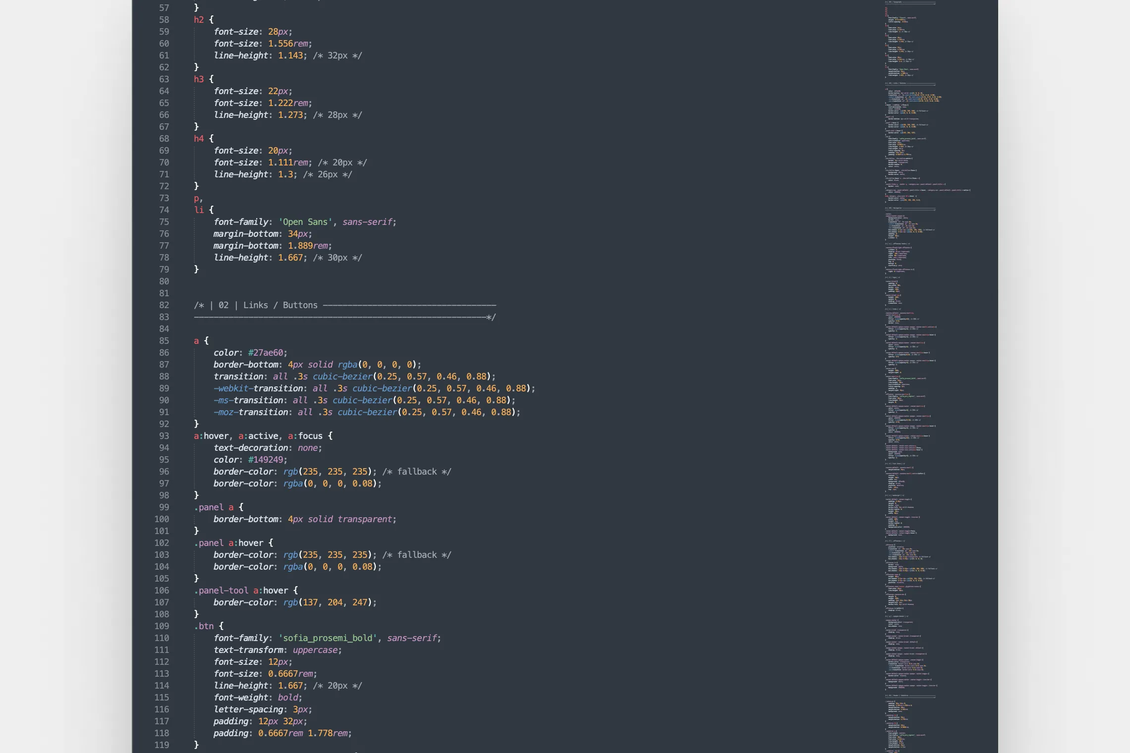
CSS
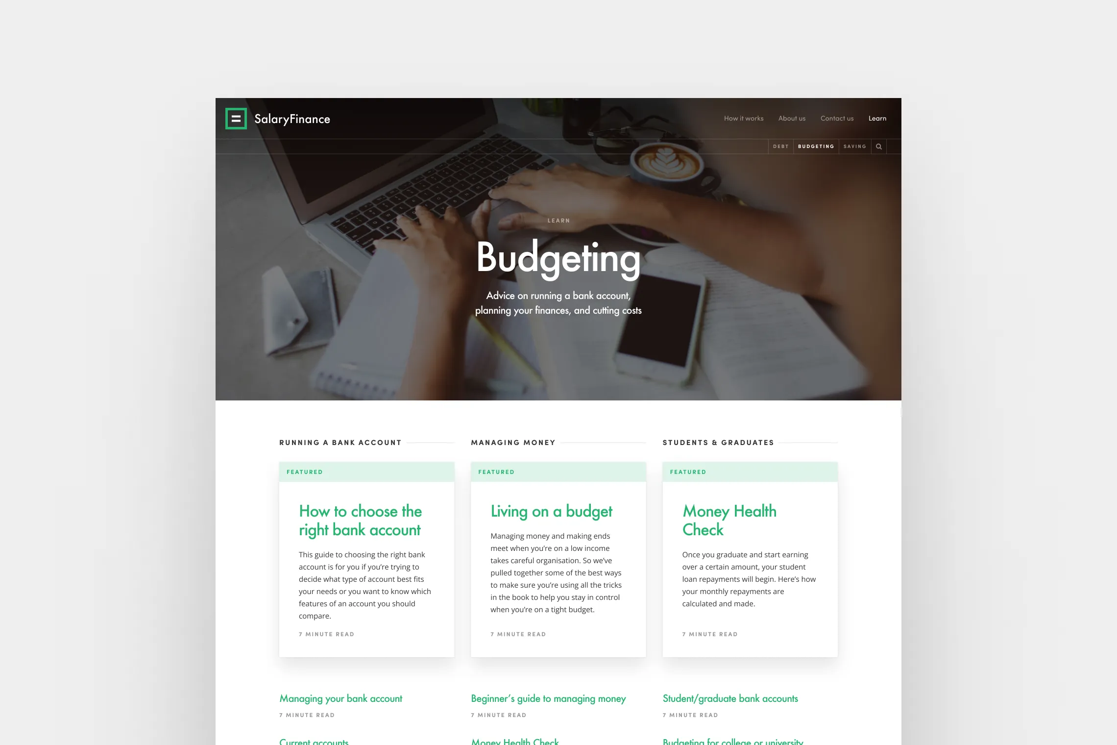
Category page
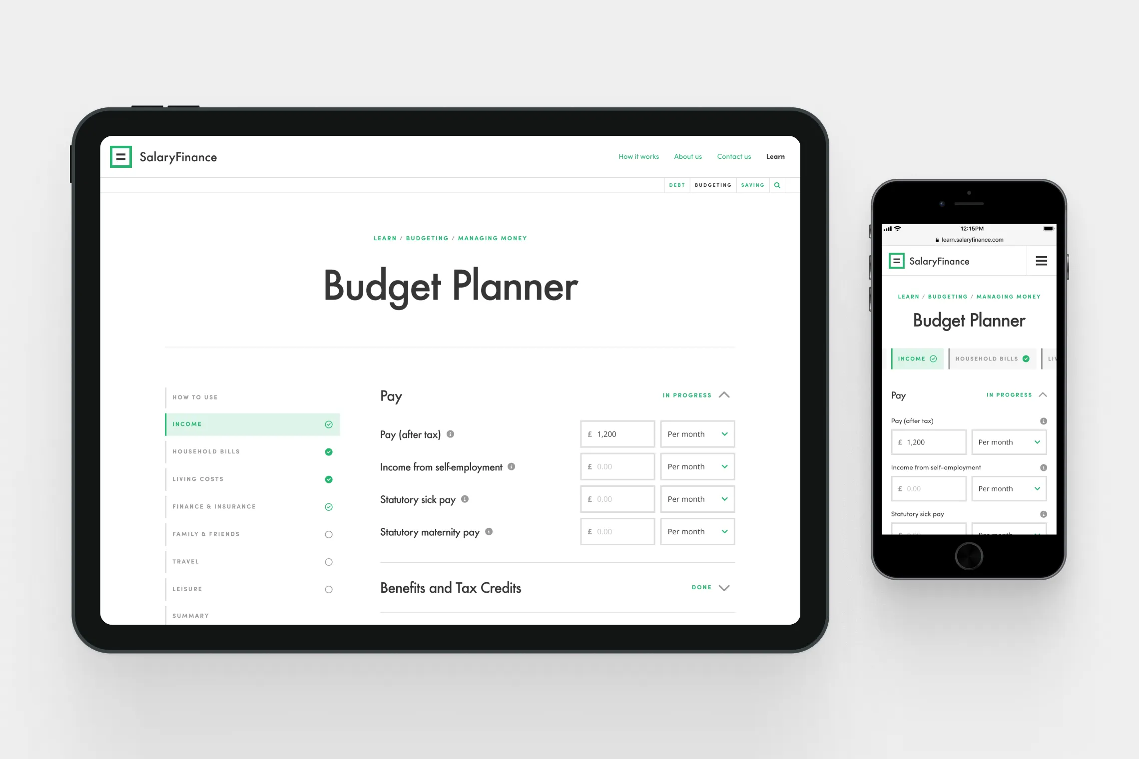
Tablet mockups — Tool page

Outcomes

Internal feedback was very positive, with members of the Salary Finance, Money Advice Service and Accelerate Digital teams praising the quick turnaround of the project and design of the site.

“Great work guys, really impressive.”

“It would have been impossible to launch this quickly without [the team’s] full commitment and great team spirit.”

3 weeks to put together an entire site — a terrific effort, well done, guys. It looks really smart & I love the video.”

“Excellent, looks really good. Well done in using pre-existing content and making it look fresh.”

“Well done guys! An amazing effort to get this live in 3 weeks, and it looks great.”

“The team and I have really enjoyed this project – felt like a true collaboration from the start for all of us.”

“Fantastic stuff guys. This will be an incredible tool for the team.”

Salary Finance's Learn hub still exists to this day, housing blogs, videos, articles and tools. Read about it over on Salary Finance's website.
SalaryFinance

SalaryFinance

Responsive microsite designed & developed to help people understand their finances

Highlights

Built & launched in 4 weeks

80+ articles

Project Details

SalaryFinance help people improve their financial health through employee-focussed salary sacrifice schemes. In 2016 the team set about to diversify their product line by launching a full-responsive microsite aimed at helping people better understand their finances, in partnership with the Money Advice Service (now MoneyHelper).

For the project I provided high-fidelity wire-framing, visual design, and HTML / CSS development (using Bootstrap). I also expanded & refined the existing Salary Finance brand assets, as well as explored the taxonomy of their navigation, offering insight into how to evolve their primary site alongside the new platform.

The platform was successfully launched within a month, with over 80 articles, 3 financial tools, and the first in a series of animations produced in-house.

Roles

UI / UX / Prototyping / Development

Year

2016

Industry

Fintech / Publishing

Landing page

Wireframes — Category page

Wireframes — Article page

Wireframes — Landing page

Expanded palette

Mobile mockups

Article page — Before & after

Card construction

Horizontal scrolling behaviour

CSS

Category page

Tablet mockups — Tool page

Outcomes

Internal feedback was very positive, with members of the Salary Finance, Money Advice Service and Accelerate Digital teams praising the quick turnaround of the project and design of the site.

“Great work guys, really impressive.”

“It would have been impossible to launch this quickly without [the team’s] full commitment and great team spirit.”

3 weeks to put together an entire site — a terrific effort, well done, guys. It looks really smart & I love the video.”

“Excellent, looks really good. Well done in using pre-existing content and making it look fresh.”

“Well done guys! An amazing effort to get this live in 3 weeks, and it looks great.”

“The team and I have really enjoyed this project – felt like a true collaboration from the start for all of us.”

“Fantastic stuff guys. This will be an incredible tool for the team.”

Salary Finance's Learn hub still exists to this day, housing blogs, videos, articles and tools. Read about it over on Salary Finance's website.

Other projects

BrandCap

BrandCap

Re-design using existing visual language, with development in Wordpress

BrandCap

BrandCap

Re-design using existing visual language, with development in Wordpress

Beam.org

Beam

Complete platform re-design, new visual identity & brand guidelines

Beam.org

Beam

Complete platform re-design, new visual identity & brand guidelines